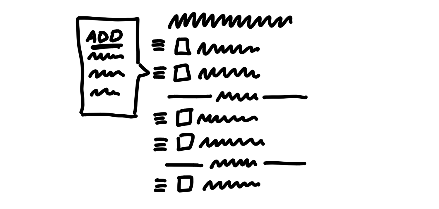
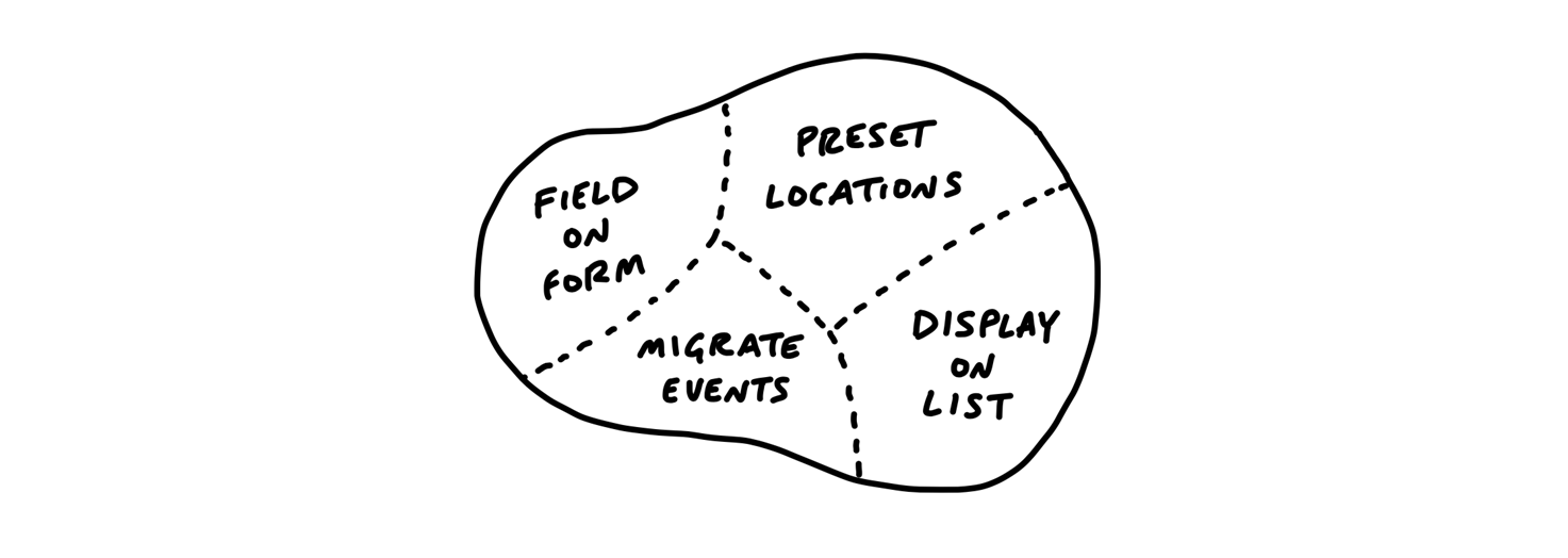
Summary
- Six week cycle, 2 week cooldown
- Shape the work
- Set appetites, not estimates
- Design at the right level of abstraction
- Breadboards and Fat Marker sketches
- build with Circuit Breakers
- Hammering the scope
Introduction
Growing pains
As software teams start to grow, some common struggles appear:
- Team members feel like projects go on and on, with no end in sight.
- Product managers can’t find time to think strategically about the product.
- Founders ask themselves: “Why can’t we get features out the door like we used to in the early days?”
Six-week cycles
Six weeks is
- long enough to build something meaningful start-to-finish
- short enough that everyone can feel the deadline looming from the start
Our decisions are based on moving the product forward in the next six weeks, not micromanaging time.
- We don’t count hours or question how individual days are spent.
- We don’t have daily meetings.
- We don’t rethink our roadmap every two weeks.
We commit the six weeks and leave the team alone to get it done.
Shaping the work
We shape the work before giving it to a team.
A small senior group works in parallel to the cycle teams defining the key elements of a solution before we consider a project ready to bet on.
When shaping, we focus less on estimates and more on our appetite.
Instead of asking how much time it will take to do some work, we ask: How much time do we want to spend?
Making teams responsible
Third, we give full responsibility to a small integrated team of designers and programmers.
- They define their own tasks,
- make adjustments to the scope,
- work together to build vertical slices of the product one at a time.
Targeting risk
At every step of the process we target a specific risk: the risk of not shipping on time.
This book isn’t about the risk of building the wrong thing. Other books can help you with that (we recommend Competing Against Luck).
This book is about the risk of getting stuck.
We reduce risk in the shaping process by solving open questions before we commit the project to a time box.
We reduce risk in the planning process by capping our bets to six weeks. If a project runs over, by default it doesn’t get an extension.
And lastly we reduce risk in the building process by integrating design and programming early.
How this book is organized
Part One is all about Shaping - the pre-work we do on projects before we consider them ready to schedule.
Part Two is about Betting - how we choose among the pitched projects and decide what to do six weeks at a time.
Part Three is about Building - the expectations we place on the teams and the special practices they use to discover what to do.
Lastly the Appendix gives you some help for when it’s time to make changes at your company.
Part 1: Shaping
Principles of Shaping
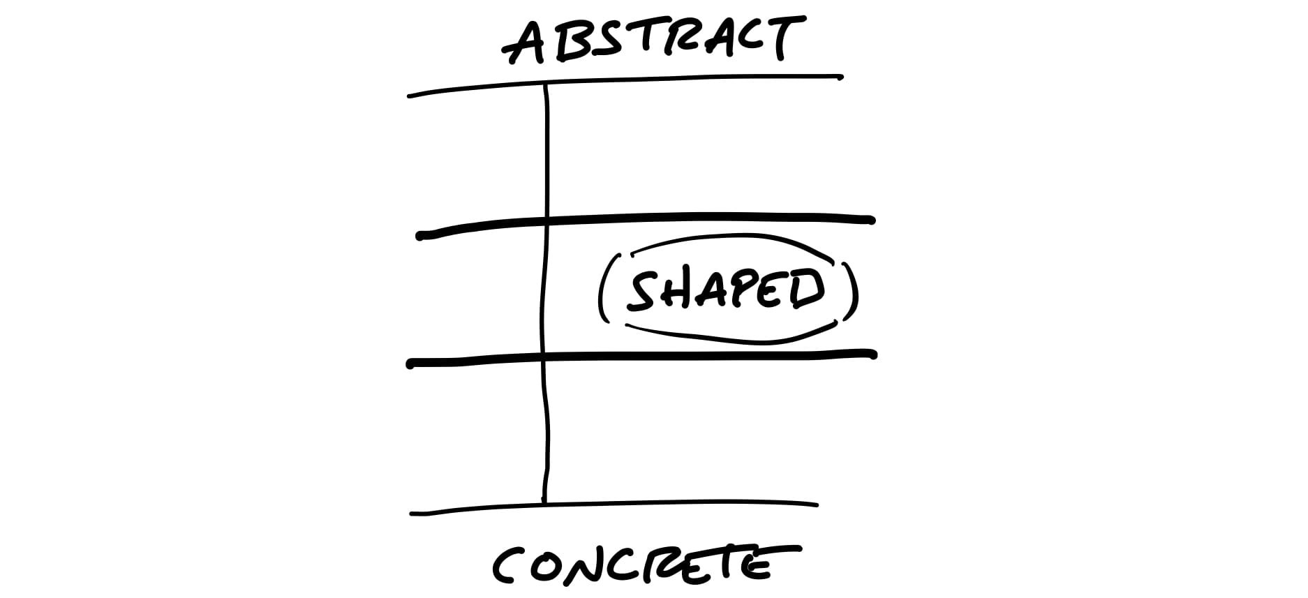
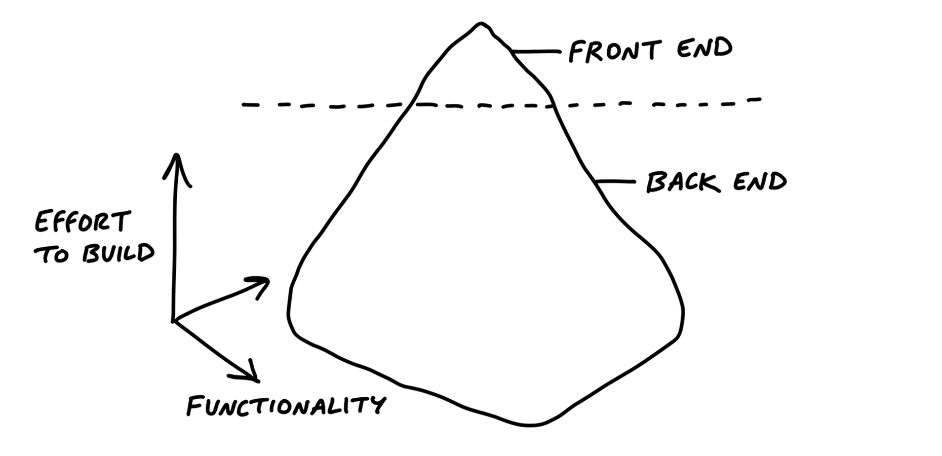
When we shape the work, we need to do it at the right level of abstraction: not too vague and not too concrete.
Wireframes are too concrete
When design leaders go straight to wireframes or high-fidelity mockups, they define too much detail too early. This leaves designers no room for creativity.
Over-specifying the design also leads to estimation errors. Counterintuitive as it may seem, the more specific the work is, the harder it can be to estimate.
Words are too abstract
When a project is defined in a few words, nobody knows what it means.
Concerning estimation, under-specified projects naturally grow out of control because there’s no boundary to define what’s out of scope.
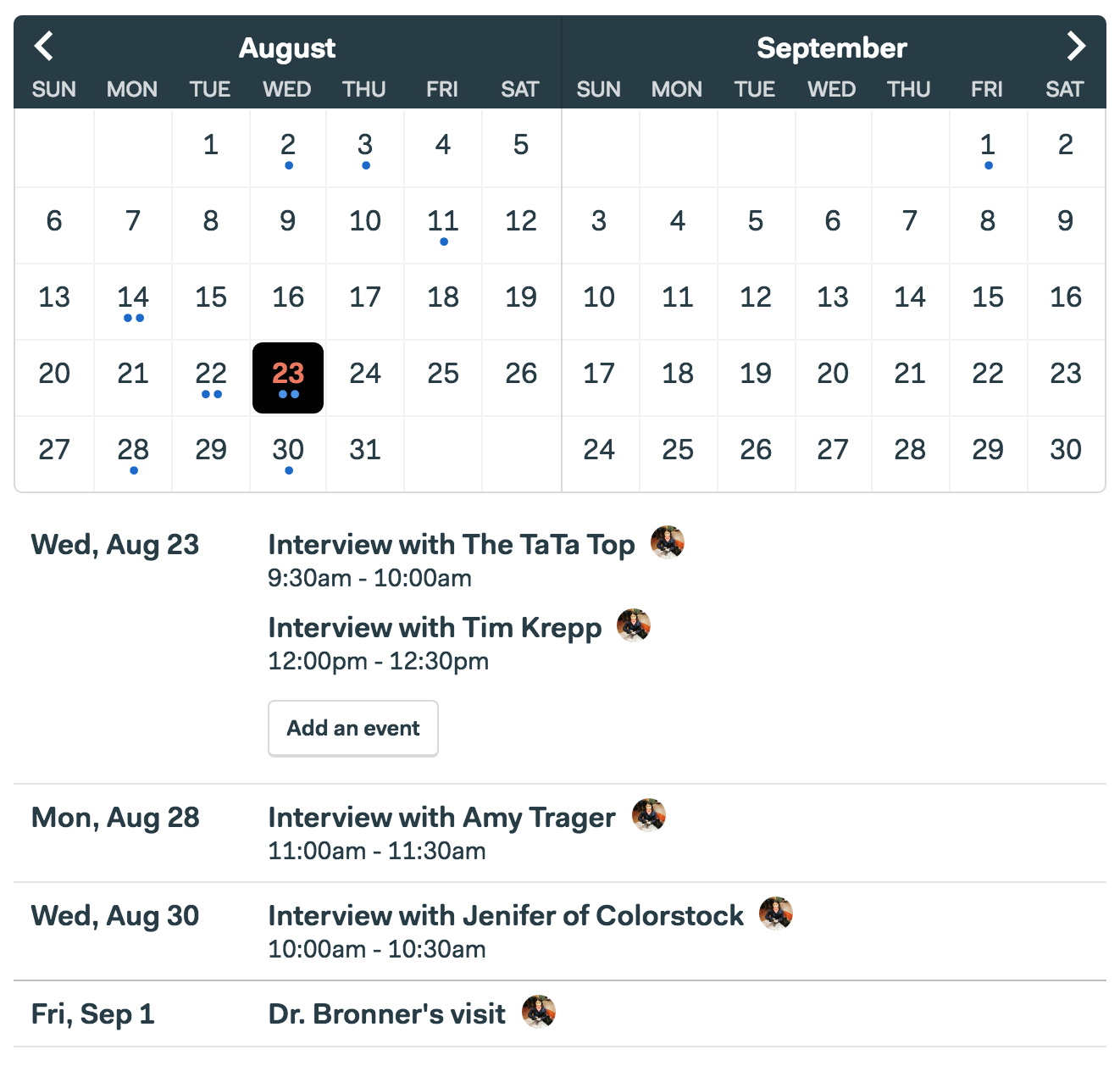
Case study: The Dot Grid Calendar
Customers started asking us to “add a calendar” to Basecamp.
We had built calendars before and we knew how complex they are. It can easily take six months or more to build a proper calendar.
With only six weeks to work with, we could only build about a tenth of what people think of when they say “calendar.” The question became: which tenth?
We did some research (discussed in the next chapter) and narrowed down a use case that we wanted to solve.
The Dot Grid wasn’t a full-featured calendar. We were comfortable with all these trade-offs because of our understanding of the use case.
This is the level of fidelity we used to define the solution:
Note how rough the sketch is and how many details are left out. The designer had a lot of room to interpret how this should look and feel.
At the end of the project, the finished work that the designers and programmers created looked like this:
Property 1: It’s rough
Everyone can tell by looking at it that it’s unfinished.
Property 2: It’s solved
Despite being rough and unfinished, shaped work has been thought through.
Property 3: It’s bounded
Lastly, shaped work indicates what not to do. It tells the team where to stop.
Who shapes
Shaping is creative and integrative. It requires combining interface ideas with technical possibilities with business priorities. To do that you’ll need to either embody these skills as a generalist or collaborate with one or two other people.
Shaping is primarily design work. The shaped concept is an interaction design viewed from the user’s perspective.
You don’t need to be a programmer to shape, but you need to be technically literate. You should be able to judge what’s possible, what’s easy and what’s hard.
It’s also strategic work. Setting the appetite and coming up with a solution requires you to be critical about the problem.
Shaping is a closed-door, creative process.
Two tracks
You can’t really schedule shaping work because, by its very nature, unshaped work is risky and unknown.
For that reason we have two separate tracks:
- one for shaping
- one for building.
Steps to shaping
- Set boundaries.
- Rough out the elements.
- Address risks and rabbit holes.
- Write the pitch.
Set Boundaries
The first step of shaping is setting boundaries on what we’re trying to do.
Setting the appetite
Whether we’re chomping at the bit or reluctant to dive in, it helps to explicitly define how much of our time and attention the subject deserves.
Appetite: a time budget for a standard team size.
We usually set the appetite in two sizes:
- Small Batch: This is a project that a team of one designer and one or two programmers can build in one or two weeks. We batch these together into a six week cycle.
- Big Batch: This project takes the same-size team a full six-weeks.
If we can’t shrink the scope, we’ll break off a meaningful part of the project that we can shape to a six-week appetite.
Fixed time, variable scope
- Estimates start with a design and end with a number.
- Appetites start with a number and end with a design.
“Good” is relative
Without a time limit, there’s always a better version.
The ultimate meal might be a ten course dinner.
But when you’re hungry and in a hurry, a hot dog is perfect.
Responding to raw ideas
Our default response to any idea that comes up should be: “Interesting. Maybe some day.”
Even if we’re excited about it, we shouldn’t make a commitment that we don’t yet understand.
Narrow down the problem
Flip from asking “What could we build?” to “What’s really going wrong?”
Case study: Defining “calendar”
Instead of asking her why she wants a calendar and what it should look like, we asked her when she wanted a calendar. What was she doing when the thought occurred to ask for it?
Watch out for grab-bags
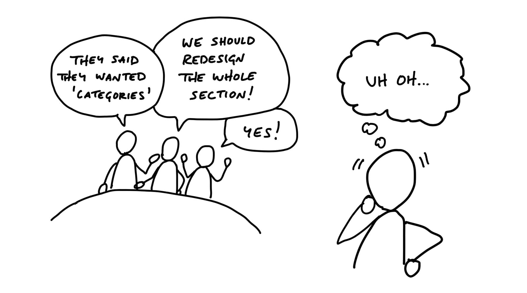
When it comes to unclear ideas, the worst offenders are “redesigns” or “refactorings” that aren’t driven by a single problem or use case.
When someone proposes something like “redesign the Files section,” that’s a grab-bag, not a project.
Here’s a more productive starting point: “We need to rethink the Files section because sharing multiple files takes too many steps.”
A tell-tale sign of a grab-bag is the “2.0” label.
Boundaries in place
When we have all three things
- a raw idea,
- an appetite,
- and a narrow problem definition
then we’re ready to move to the next step and define the elements of a solution.
Find the Elements
Move at the right speed
First, we need to have the right people, or nobody, in the room.
Second, we need to avoid the wrong level of detail in the drawings and sketches.
The questions we’re trying to answer are:
- Where in the current system does the new thing fit?
- How do you get to it?
- What are the key components or interactions?
- Where does it take you?
Breadboarding

There are three basic things we’ll draw:
- Places: These are things you can navigate to, like screens
- Affordances: These are things the user can act on
- Connection lines: These show how the affordances take the user from place to place.
We’ll use words for everything instead of pictures.
Example

Writing out the flows confronts us with questions we didn’t originally think of and stimulates design ideas without distracting us with unimportant visual choices.
We’re getting more concrete while still leaving out a huge amount of detail.
Fat marker sketches
Sometimes the idea we have in mind is a visual one. Breadboarding would just miss the point because the 2D arrangement of elements is the fundamental problem. In that case, we still don’t want to waste time on wireframes or unnecessary fidelity. Instead we use fat marker sketches.
A fat marker sketch is a sketch made with such broad strokes that adding detail is difficult or impossible.
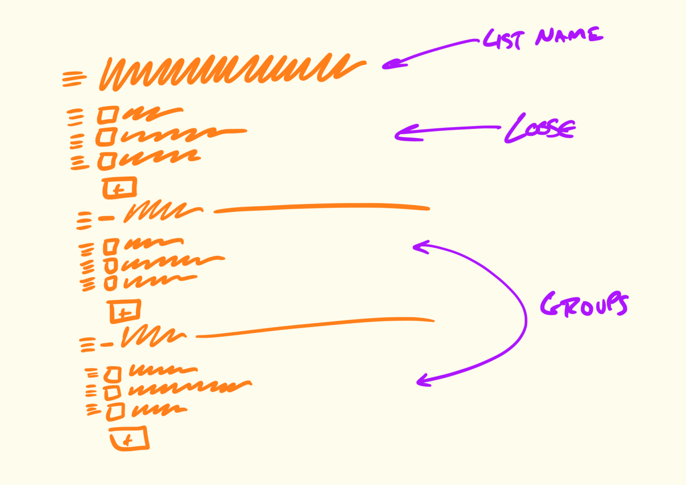
Here’s an example. We found ourselves often creating fake to-dos in our Basecamp to-do lists that acted as dividers.
We had to work out what the implications of adding a divider were.
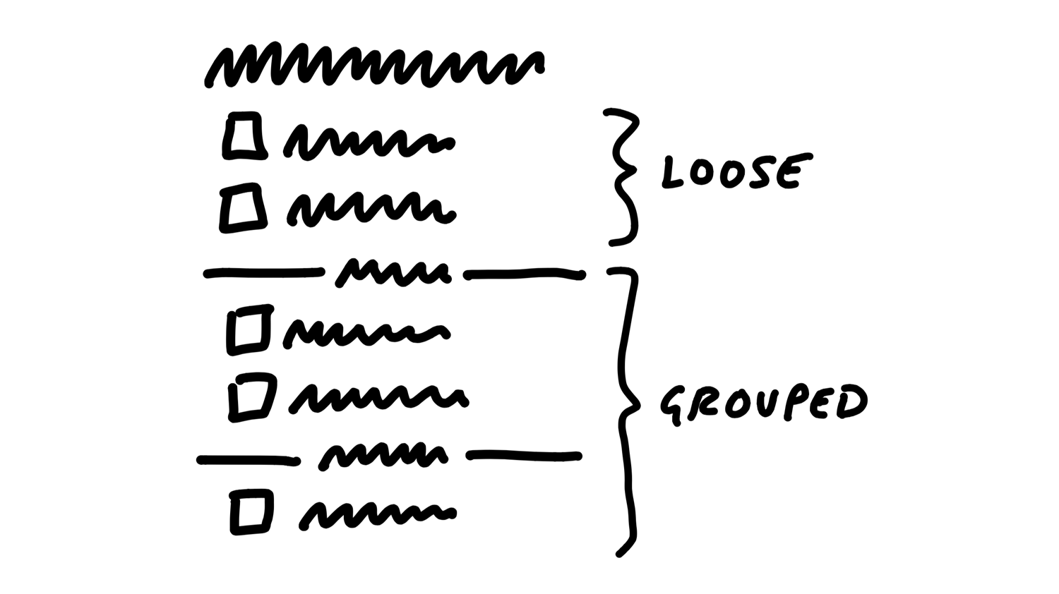
We could add items via some affordance within each group, including the “loose” group on top.
We were a little concerned the add buttons might break up the gestalt of the list, and the groups might all separate too much from the lists on the page.
This notation is much less constraining than breadboards, which has downsides. We might sketch a sidebar and get attached to a layout element like that even though it’s not a core element.
Elements are the output
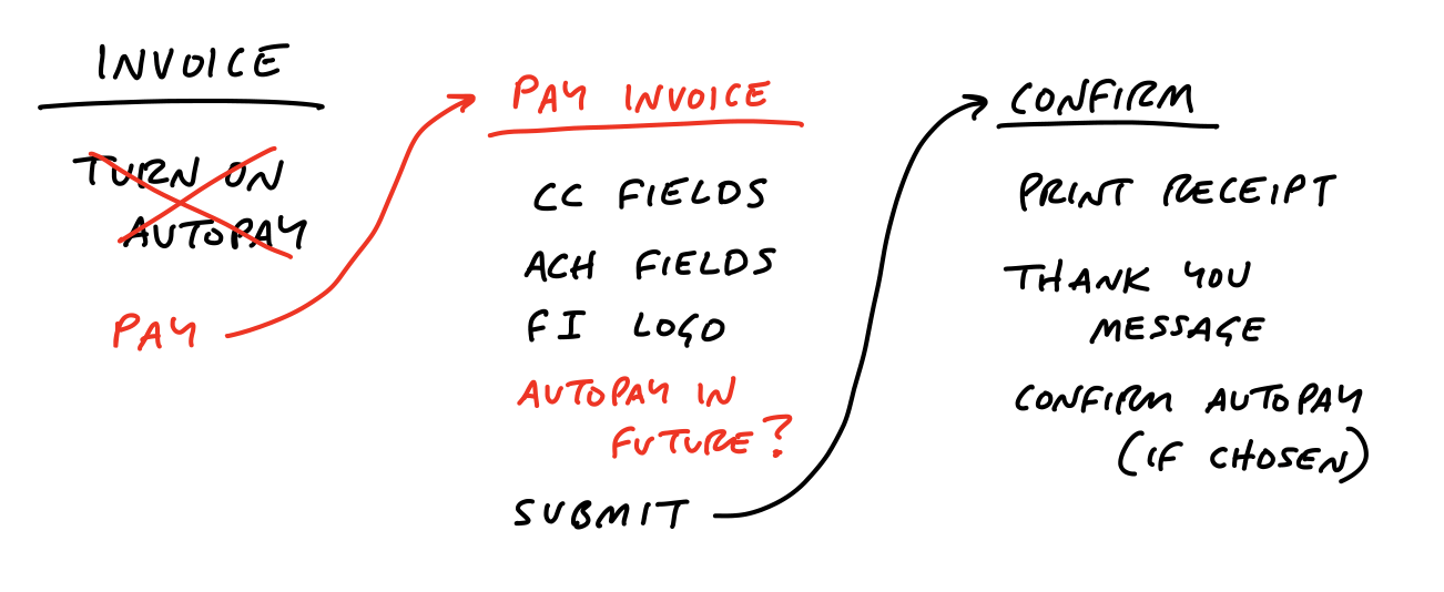
In the case of the Autopay example, we ended up with some clear elements:
- A new “use this to Autopay?” checkbox on the existing “Pay an invoice” screen
- A “disable Autopay” option on the invoicer’s side
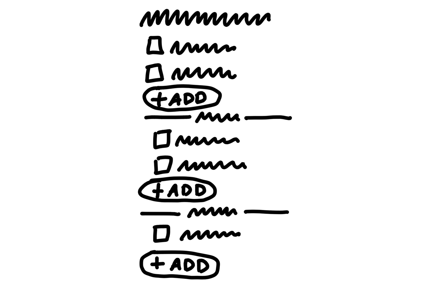
For the To-Do Groups project, the elements were:
- Loose to-dos above the first group belong directly to the parent
- Grouped to-dos appear below the loose to-dos
- We’d like to try an add affordance within each section, but if that doesn’t work visually, we’re ok with relying on the action menu for inserting to-dos into position.
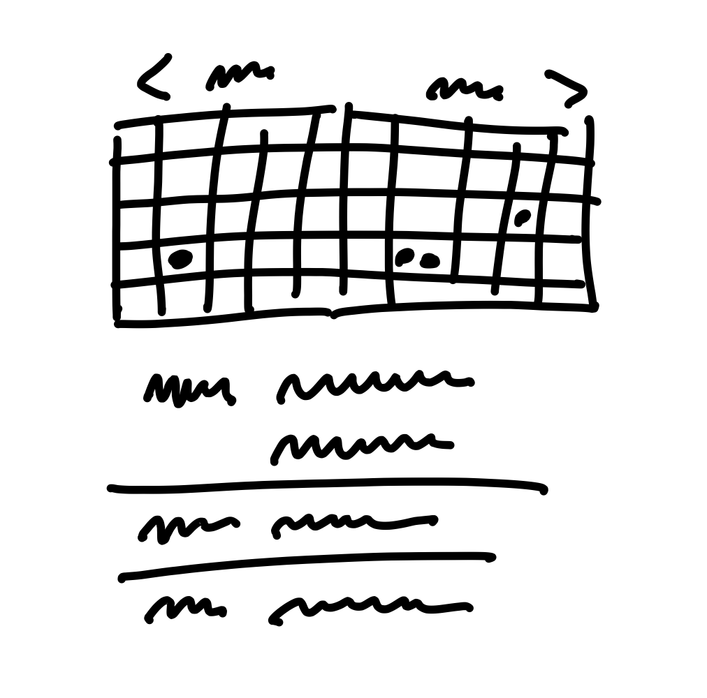
Similarly, when we sketched the simplified solution for rendering events on a calendar grid, we used the fat marker approach.
This enabled us to work out the main elements of the solution:
- A 2-up monthly calendar grid
- Dots for events, no spanned pills
- Agenda-style list of events below that scrolls an event into view when you tap a dot
Room for designers
By leaving details out, the breadboard and fat marker methods give room to designers in subsequent phases of the project.
Not deliverable yet
It’s normal for the artifacts at this point - on the wall or in your notebook - to be more or less indecipherable to anybody who wasn’t there with you.
The next step is to do some stress-testing and de-risking.
No conveyor belt
Also keep in mind that, at this stage, we could walk away from the project. We haven’t bet on it.
Risks and Rabbit Holes

Remember that we’re shaping work for a fixed time window.
Sometimes you run into problems that don’t just delay the project - they have no apparent solution.
Of course there will always be unknowns. That’s why we apply the many practices in Part Three so that teams tackle the right problems in the right order, leaving room for the unexpected. But that doesn’t mean we shouldn’t look for the pitfalls we can find up front and eliminate them before betting
Different categories of risk
In terms of risk, well-shaped work looks like a thin-tailed probability distribution.
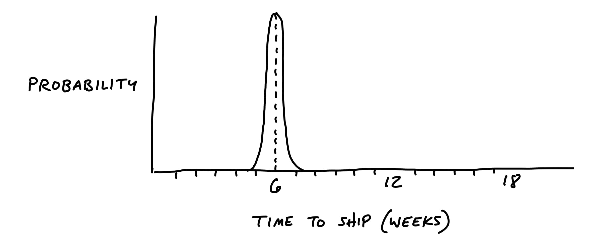
However, if there are any rabbit holes in the shaping, the project could take multiple times the original appetite to complete.
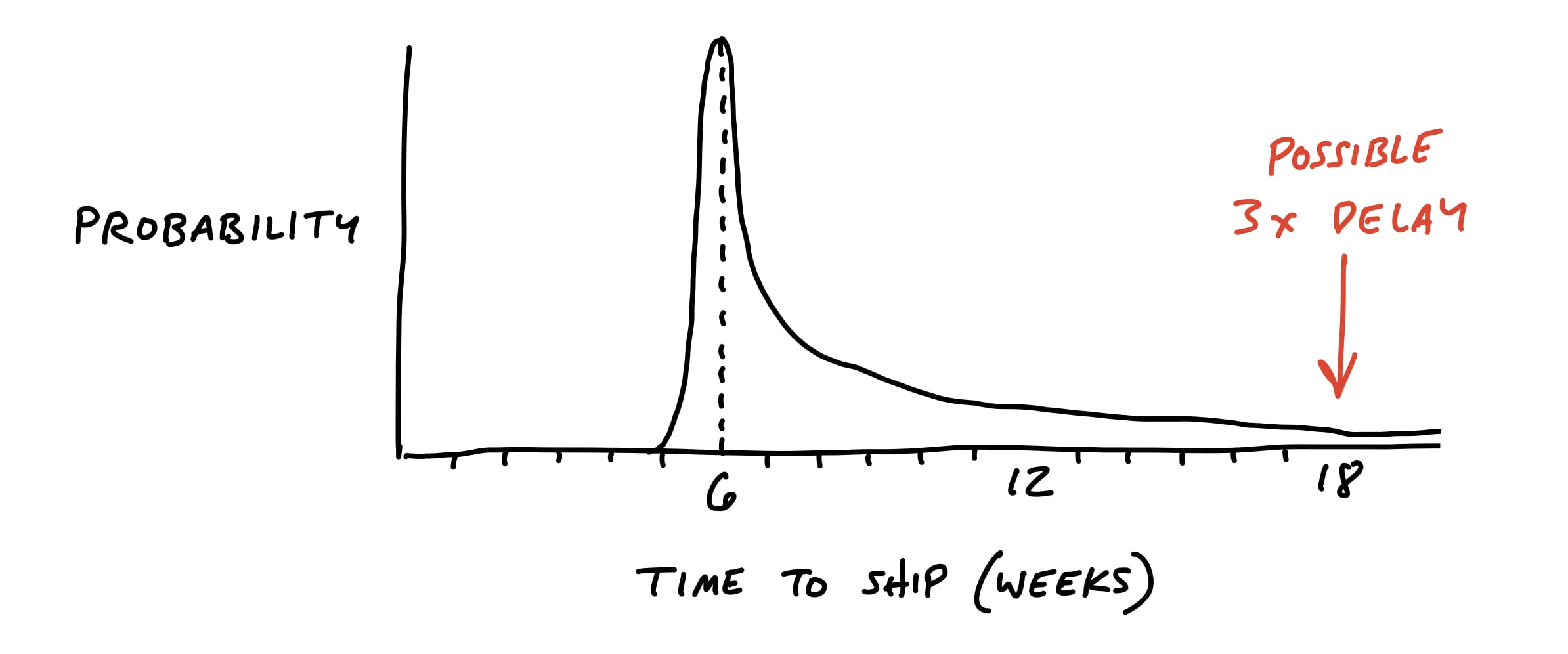
We want to remove the unknowns and tricky problems from the project so that our probability is as thin-tailed as possible.
Look for rabbit holes
In this step, we slow down and look critically at what we came up with. Did we miss anything? Are we making technical assumptions that aren’t fair?
Then we should also question the viability of each part we think we solved. We ask ourselves questions like:
- Does this require new technical work we’ve never done before?
- Are we making assumptions about how the parts fit together?
- Are we assuming a design solution exists that we couldn’t come up with ourselves?
- Is there a hard decision we should settle in advance so it doesn’t trip up the team?
Case study: Patching a hole
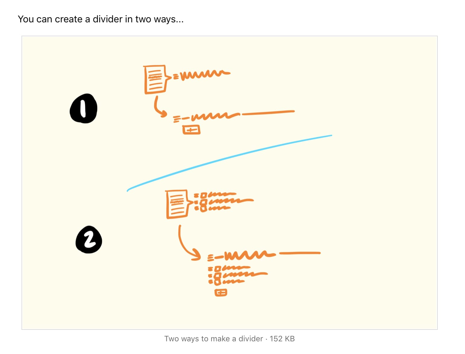
For example, when we defined the To-Do Groups project, we introduced the idea of dividers in the to-do list:
We liked the idea of the dividers, and the logic of loose versus grouped to-dos made sense to us. But when we looked closer we realized that we didn’t address how to display completed items.
This is the kind of trade-off that’s difficult to make when you’re working inside the cycle under pressure. There are lots of reasons why a different design or a deeper reconsideration of completed to-dos would be objectively better.
Declare out of bounds
Since everyone on the team wants to do their best work, they will of course look for all the use cases to cover and consider them necessary.
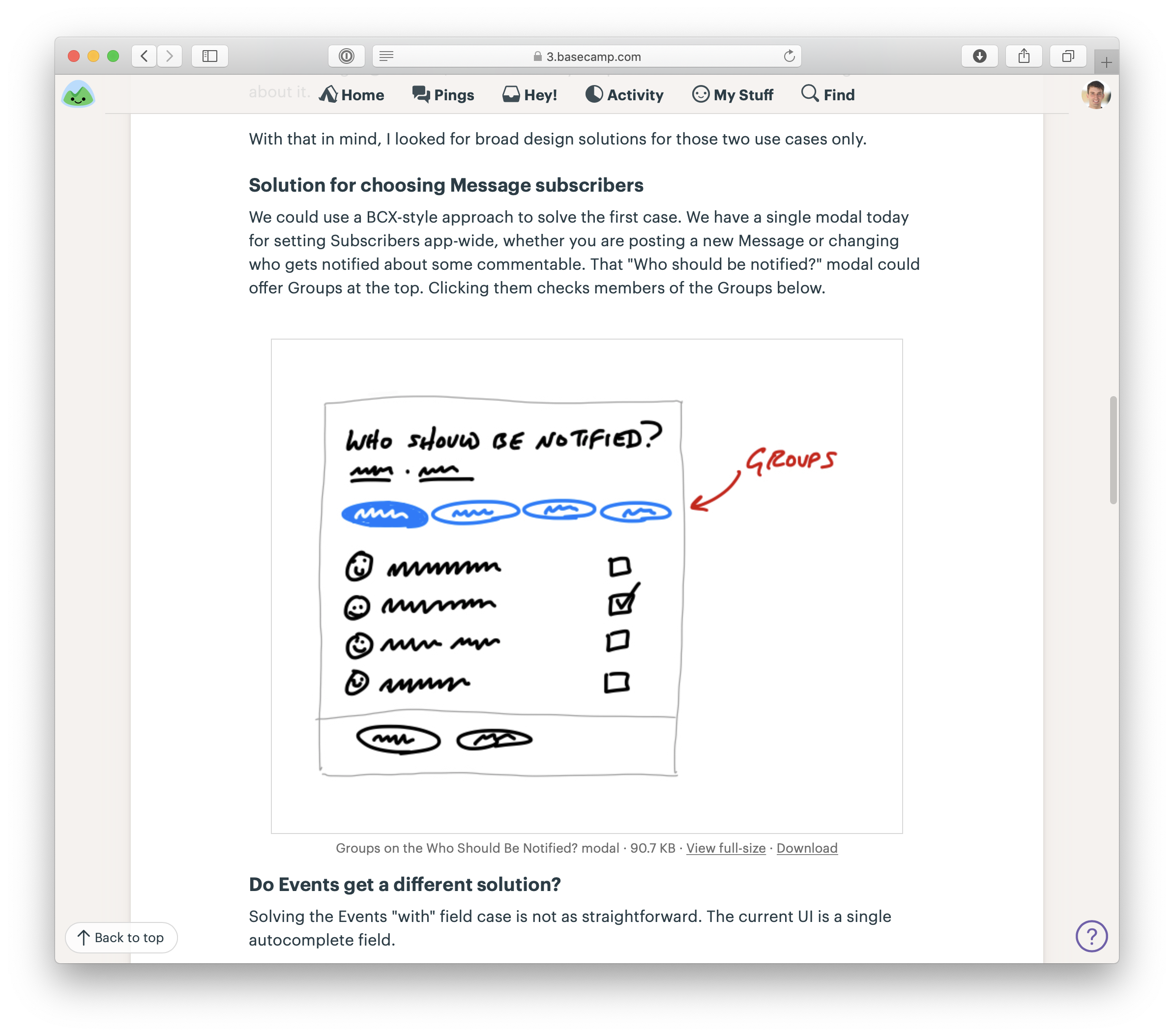
For example, we worked on an idea for notifying groups of people in Basecamp. Rather than checking off five programmers one by one, you could just click “Programmers” and they’d be selected for notification. As we looked at the product, we saw tons of places where this kind of behavior might make sense. If we let you choose a group when posting a message, why not when assigning a to-do, or mentioning people in the chat room?
We decided for the purpose of the project that the core value was narrowing down who to notify about a message. We explicitly marked off the other cases as “out of bounds” for the project and focused on the win we wanted: a faster flow for posting messages.
Cut back
There may be parts of the solution we got excited about during the sketching phase that aren’t really necessary.
Present to technical experts
Up to this point shaping has been a closed-door activity.
This is a good time to grab some technical experts and walk them through the idea.
Beware the simple question: “Is this possible?” In software, everything is possible but nothing is free.
Talk through the constraints of how this is a good solution given the appetite, so they’re partners in keeping the project at the size you intend.
And emphasize that you’re looking for risks that could blow up the project.
De-risked and ready to write up
At the end of this stage, we have
- the elements of the solution,
- patches for potential rabbit holes,
- and fences around areas we’ve declared out of bounds.
That means we’re ready to make the transition from privately shaping and getting feedback from an inner-circle to presenting the idea at the betting table.
Write the Pitch
We’ve got the elements of a solution now, and we’ve de-risked our concept to the point that we’re confident it’s a good option to give a team.
Now we need to put the concept into a form that other people will be able to understand, digest, and respond to.
The purpose of the pitch is to present a good potential bet. It’s basically a presentation.
There are five ingredients that we always want to include in a pitch:
- Problem - The raw idea, a use case, or something we’ve seen that motivates us to work on this
- Appetite - How much time we want to spend and how that constrains the solution
- Solution - The core elements we came up with, presented in a form that’s easy for people to immediately understand
- Rabbit holes - Details about the solution worth calling out to avoid problems
- No-gos - Anything specifically excluded from the concept: functionality or use cases we intentionally aren’t covering to fit the appetite or make the problem tractable
Ingredient 1. Problem
It’s critical to always present both a problem and a solution together.
Diving straight into “what to build” - the solution - is dangerous. You don’t establish any basis for discussing whether this solution is good or bad without a problem.
The best problem definition consists of a single specific story that shows why the status quo doesn’t work.
Ingredient 2. Appetite
Not only do we want to solve this use case, we want to come up with a way to do it in six weeks, not three months, or - in the case of a small batch project - two weeks, not the whole six weeks.
Ingredient 3. Solution
A problem without a solution is unshaped work.
If the solution isn’t there, someone should go back and do the shaping work on the shaping track.
Help them see it
We need more concreteness, but we don’t want to over-specify the design with wireframes or high-fidelity mocks.
Embedded sketches
Suppose your breadboard from the shaping session looked like this:
People might have trouble visualizing where these new affordances go on the Dashboard. We could sketch a new box on the Dashboard to make it clearer:
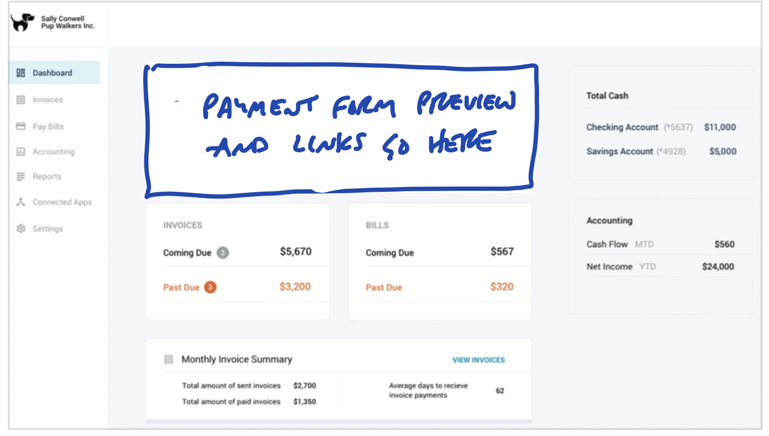
But we’re still asking people to imagine too much. It’s worth the trade-off to go one step down into fat-marker detail here.
Annotated fat marker sketches
Sometimes ideas are inherently visual or a little too complicated to express in a schematic breadboard. Fat marker sketches can be very effective in a pitch; you just need to take more care to label them cleanly.
Redrawing the sketch on an iPad - still with a fat brush size - works well. You can use different colors to separate the labels from the material parts of the sketch.
Or you might add some call-outs to enable discussion of specific elements.
Ingredient 4. Rabbit holes
Sometimes addressing a rabbit hole just requires a few lines of text.
Ingredient 5. No Gos
Lastly if there’s anything we’re not doing in this concept, it’s good to mention it here.
Examples
Here are two examples of real pitches.
This pitch for grouping to-dos together starts by showing a workaround people are using in the current design. Then it sketches out all the main ideas for how to enable optional to-do groupings.

Two screenshots demonstrate the problem. Fat marker sketches describe the solution. Rabbit holes motivated some of the sketches.
This pitch for changing how notifications work starts with two videos to demonstrate the problem. The black boxes toward the end are a visualization of user behavior data that supports a decision in the pitch.

Two videos show the problem. A fat marker sketch and a breadboard describe the solution. The black boxes contain data visualizations that support trade-offs in the solution.
Ready to present
We prefer asynchronous communication by default and escalate to real-time only when necessary.
That means the first step for presenting a pitch is posting the write-up with all the ingredients above somewhere that stakeholders can read it on their own time. This keeps the betting table short and productive. In ideal conditions everyone has time to read the pitches in advance. And if that isn’t possible in some cases, the pitch is ready to pull up for a quick live sell.
How we do it in Basecamp
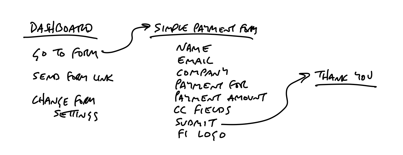
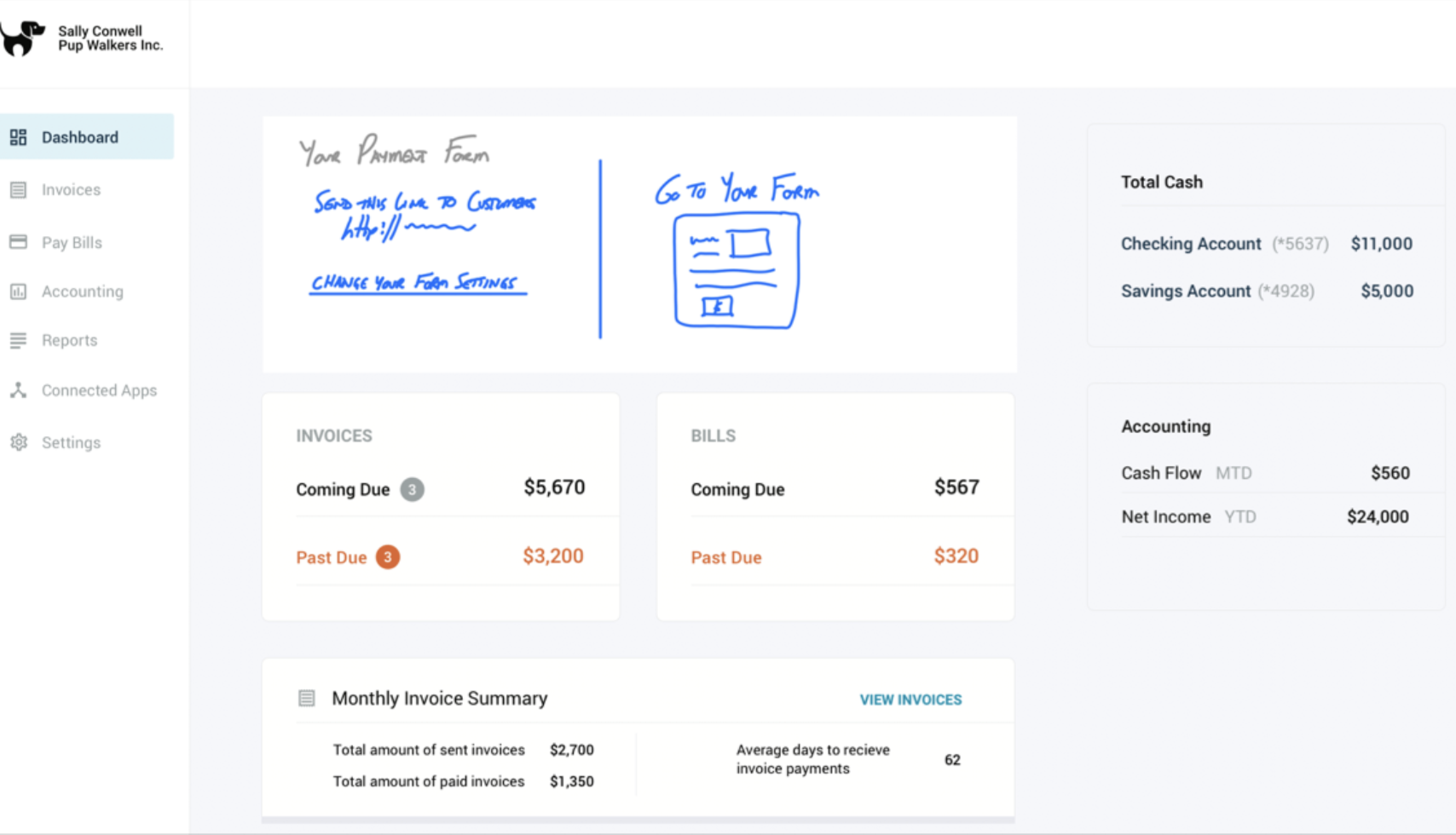
We post pitches as Messages in Basecamp. We created a Message Category called Pitch so we can easily find them. Pitches are posted to a Team called Product Strategy that can be accessed by people on the betting table.
Pitches on the Message Board of the Product Strategy team in Basecamp
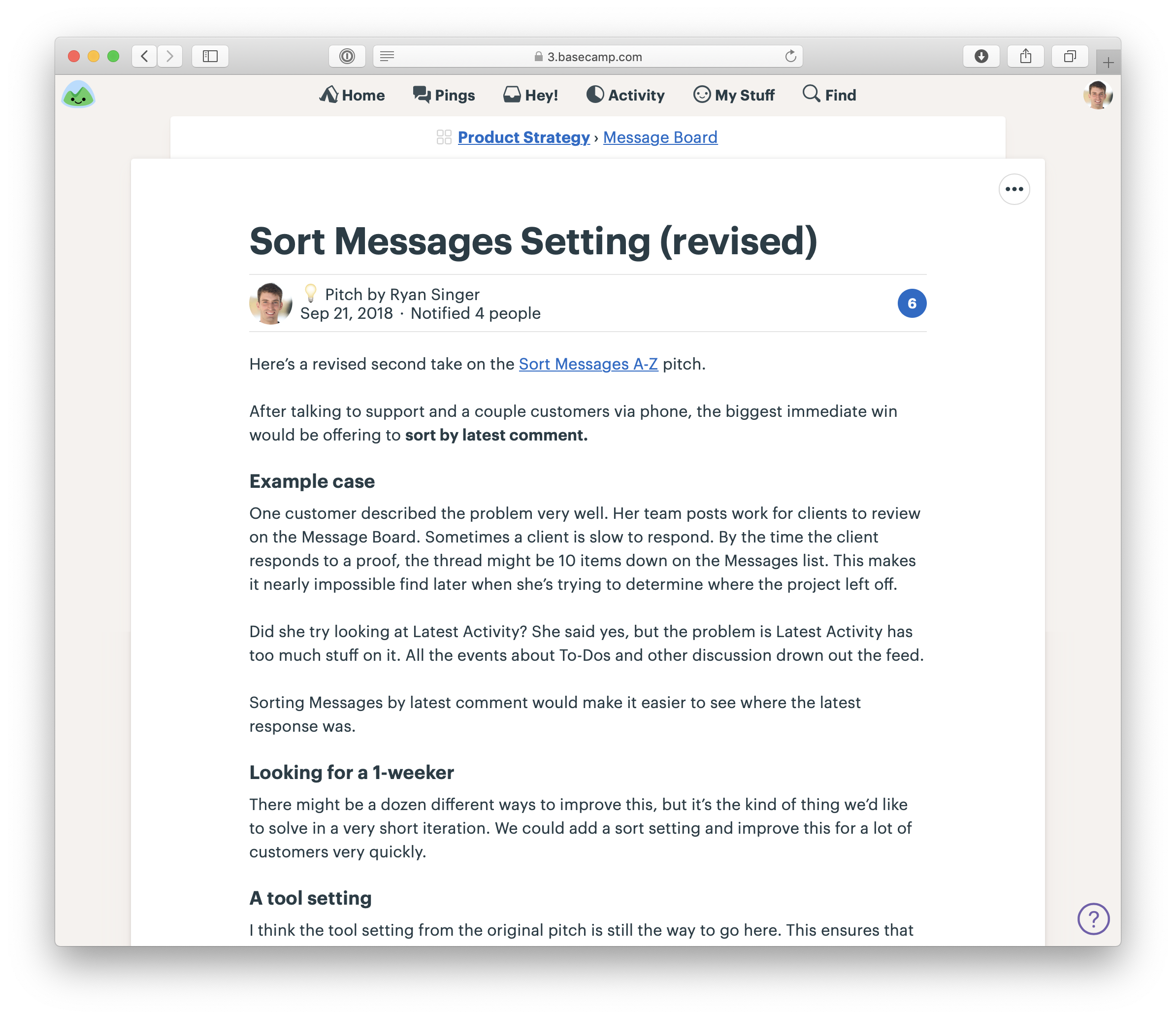
A pitch as a Message. Note the one-week appetite. This was a Small Batch project.
When we need to include a fat marker sketch in a pitch, we’ll draw it on an iPad (with Notability) and take a screenshot. Basecamp’s text editor makes it easy to insert images and caption them so they make sense in the flow of the pitch.
A sketch drawn on an iPad in the middle of a pitch
People comment on the pitch asynchronously. Not to say yes or no - that happens at the betting table - but to poke holes or contribute missing information.

Our CTO responds with technical thoughts on the pitch.
Part 2: Betting
Bets, Not Backlogs
No backlogs
Backlogs are a big weight we don’t need to carry. Dozens and eventually hundreds of tasks pile up that we all know we’ll never have time for.
The growing pile gives us a feeling like we’re always behind even though we’re not.
The time spent constantly reviewing, grooming and organizing old ideas prevents everyone from moving forward on the timely projects that really matter right now.
A few potential bets
So what do we do instead? Before each six-week cycle, we hold a betting table where stakeholders decide what to do in the next cycle. At the betting table, they look at pitches from the last six weeks - or any pitches that somebody purposefully revived and lobbied for again.
If we decide to bet on a pitch, it goes into the next cycle to build. If we don’t, we let it go. There’s nothing we need to track or hold on to.
What if the pitch was great, but the time just wasn’t right? Anyone who wants to advocate for it again simply tracks it independently - their own way - and then lobbies for it six weeks later.
Decentralized lists
We don’t have to choose between a burdensome backlog and not remembering anything from the past. Everyone can still track pitches, bugs, requests, or things they want to do independently without a central backlog.
- Support can keep a list of requests or issues that come up more often than others.
- Product tracks ideas they hope to be able to shape in a future cycle.
- Programmers maintain a list of bugs they’d like to fix when they have some time.
Regular but infrequent one-on-ones between departments help to cross-pollinate ideas for what to do next.
This approach spreads out the responsibility for prioritizing and tracking what to do and makes it manageable.
Important ideas come back
It’s easy to overvalue ideas. The truth is, ideas are cheap. They come up all the time and accumulate into big piles.
Really important ideas will come back to you.
When’s the last time you forgot a really great, inspiring idea?
And if it’s not that interesting - maybe a bug that customers are running into from time to time - it’ll come back to your attention when a customer complains again or a new customer hits it.
If you hear it once and never again, maybe it wasn’t really a problem. And if you keep hearing about it, you’ll be motivated to shape a solution and pitch betting time on it in the next cycle.
Bet Six Weeks
Six-week cycles
Committing time and people is difficult if we can’t easily determine who’s available and for how long.
When people are available at different times due to overlapping projects, project planning turns into a frustrating game of Calendar Tetris. Working in cycles drastically simplifes this problem. A cycle gives us a standard project size both for shaping and scheduling.
Two weeks is too short to get anything meaningful done.
Six weeks is long enough to finish something meaningful and still short enough to see the end from the beginning.
Cool-down
After each six-week cycle, we schedule two weeks for cool-down. This is a period with no scheduled work where we can breathe, meet as needed, and consider what to do next.
During cool-down, programmers and designers on project teams are free to work on whatever they want.
Team and project sizes
In addition to standardizing the length of our cycles, we also roughly standardize the types of projects and teams that we bet on.
Our project teams consist of either one designer and two programmers or one designer and one programmer.
They’re joined by a QA person who does integration testing later in the cycle.
These teams will either spend the entire cycle working on one project, or they’ll work on multiple smaller projects during the cycle.
We call the team that spends the cycle doing one project the big batch team and the team working on a set of smaller projects the small batch team.
Small batch projects usually run one or two weeks each. It’s up to the small batch team to figure out how to juggle the work so they all ship before the end of the cycle.
Now that we have a standard way to think about capacity, we can talk about how we decide what to schedule.
The betting table
The betting table is a meeting held during cool-down where stakeholders decide what to do in the next cycle.
Our betting table at Basecamp consists of the CEO (who in our case is the last word on product), CTO, a senior programmer, and a product strategist (myself).
C-level time is only available in small slices, so there’s an atmosphere of “waste no time” and the call rarely goes longer than an hour or two.
Everyone has had a chance to study the pitches on their own time beforehand.
Ad-hoc one-on-one conversations in the weeks before usually establish some context too.
The output of the call is a cycle plan.
This buy-in from the very top is essential to making the cycles turn properly.
The meeting is short, the options well-shaped, and the headcount low.
The meaning of a bet
We talk about “betting” instead of planning because it sets different expectations.
First, bets have a payout. We’re not just filling a time box with tasks until it’s full.
Second, bets are commitments. If we bet six weeks, then we commit to giving the team the entire six weeks to work exclusively on that thing with no interruptions.
Third, a smart bet has a cap on the downside. If we bet six weeks on something, the most we can lose is six weeks.
Uninterrupted time
It’s not really a bet if we say we’re dedicating six weeks but then allow a team to get pulled away to work on something else.
When people ask for “just a few hours” or “just one day,” don’t be fooled. Momentum and progress are second-order things, like growth or acceleration. You can’t describe them with one point. You need an uninterrupted curve of points.
When you pull someone away for one day to fix a bug or help a different team, you don’t just lose a day. You lose the momentum they built up and the time it will take to gain it back. Losing the wrong hour can kill a day. Losing a day can kill a week.
What if something comes up during that six weeks? We still don’t interrupt the team and break the commitment.
If the cycle passes and that thing is still the most important thing to do, we can bet on it for that cycle.
The circuit breaker
We combine this uninterrupted time with a tough but extremely powerful policy. Teams have to ship the work within the amount of time that we bet. If they don’t finish, by default the project doesn’t get an extension.
First, it eliminates the risk of runaway projects.
Second, if a project doesn’t finish in the six weeks, it means we did something wrong in the shaping. We can use the shaping track on the next six weeks to come up with a new or better solution.
Finally, the circuit breaker motivates teams to take more ownership over their projects.
What about bugs?
If the teams aren’t interrupted in the six week cycle, how do we handle bugs that come up?
First we should step back and question our assumptions about bugs.
There is nothing special about bugs that makes them automatically more important than everything else. All software has bugs.
The question is: how severe are they? If we’re in a real crisis - data is being lost, the app is grinding to a halt, or a huge swath of customers are seeing the wrong thing - then we’ll drop everything to fix it. But crises are rare.
That said, nobody likes bugs. We still want ways to deal with them. Three strategies have worked for us.
- Use cool-down.
- Bring it to the betting table.
- Schedule a bug smash. Once a year - usually around the holidays - we’ll dedicate a whole cycle to fixing bugs.
Keep the slate clean
The key to managing capacity is giving ourselves a clean slate with every cycle. That means only betting one cycle at a time and never carrying scraps of old work over.
Even if we have some kind of road map in our heads at the time scale above cycles, we keep it in our heads and in our side-channel discussions.
What about projects that just can’t be done in one cycle? In that case we still only bet six weeks at a time.
We reduce our risk dramatically by shaping a specific six week target, with something fully built and working at the end of that six weeks. If that goes as expected, we’ll feel good about betting the next six weeks.
Common questions to ask
Does the problem matter?
Of course, any problem that affects customers matters. But we have to make choices because there will always be more problems than time to solve them.
So we weigh problems against each other. Is this problem more important than that problem right now?
Is the appetite right?
It’s good when we have a solution shaped to a reasonable time frame, like two or six weeks. But we might still debate whether it’s worth the time.
Suppose a stakeholder says they aren’t interested in spending six weeks on a given pitch. The negotiation could go a couple directions from there:
- Maybe the problem wasn’t articulated well enough, and there’s knowledge that the shaper can add to the conversation right now to swing opinion.
- Sometimes saying “no” to the time commitment is really saying no to something else.
- The shaper might just let the idea go if interest is too low.
- The shaper might go back to the drawing table and either work on a smaller version (for a shorter appetite) or do more research
Is the solution attractive?
The problem may be important and the appetite fair, but there can be differences about the solution.
If someone offers an immediate design solution, like “how about we move that button to an action menu instead,” we might discuss it. But generally we’ll avoid doing design work or discussing technical solutions for longer than a few moments at the betting table.
Is this the right time?
The kind of project we want to do next can depend on which projects we’ve done recently.
The project’s great; it’s just not the right time.
Are the right people available?
As part of the betting process we choose who specifically will play which role on each team. Different projects require different expertise.
The type of work each person has been doing is another factor. Someone who’s done a long string of small batch projects might prefer to take on a big batch, or vice versa.
And lastly there’s always a little Calendar Tetris with peoples’ availability. Vacations or sabbaticals affect which projects we can schedule in the coming cycle.
We’ve seen some other companies use a different model where instead of assigning the projects to people, they let the team members choose which projects they want to work on. Culturally, we are too meeting-averse for this extra step. But we’ve heard it can work well for some teams because the project teams have a little more buy-in.
Make the announcement
After the bets are made, one of us will write a message that tells everyone which projects we’re betting on for the next cycle and who will be working on them.
Part 3: Building
Hand Over Responsibility
Assign projects, not tasks
We don’t start by assigning tasks to anyone.
Splitting the project into tasks up front is like putting the pitch through a paper shredder.
Talented people don’t like being treated like “code monkeys” or ticket takers.
We’ve done the shaping. We’ve set the boundaries. Now we are going to trust the team to fill in the outline from the pitch with real design decisions and implementation.
Done means deployed
At the end of the cycle, the team will deploy their work. This constraint keeps us true to our bets and respects the circuit breaker.
That also means any testing and QA needs to happen within the cycle.
For most projects we aren’t strict about the timing of help documentation, marketing updates, or announcements to customers and don’t expect those to happen within the cycle. Those are thin-tailed from a risk perspective
Kick-off
We start the project by creating a new project and adding the team to it.
Then the first thing we’ll do is post the shaped concept to the Message Board. We’ll either post the original pitch or a distilled version of it.
Since our teams are remote, we arrange a kick-off call.
The call gives the team a chance to ask any important questions that aren’t clear from the write-up. Then, with a rough understanding of the project, they’re ready to get started.
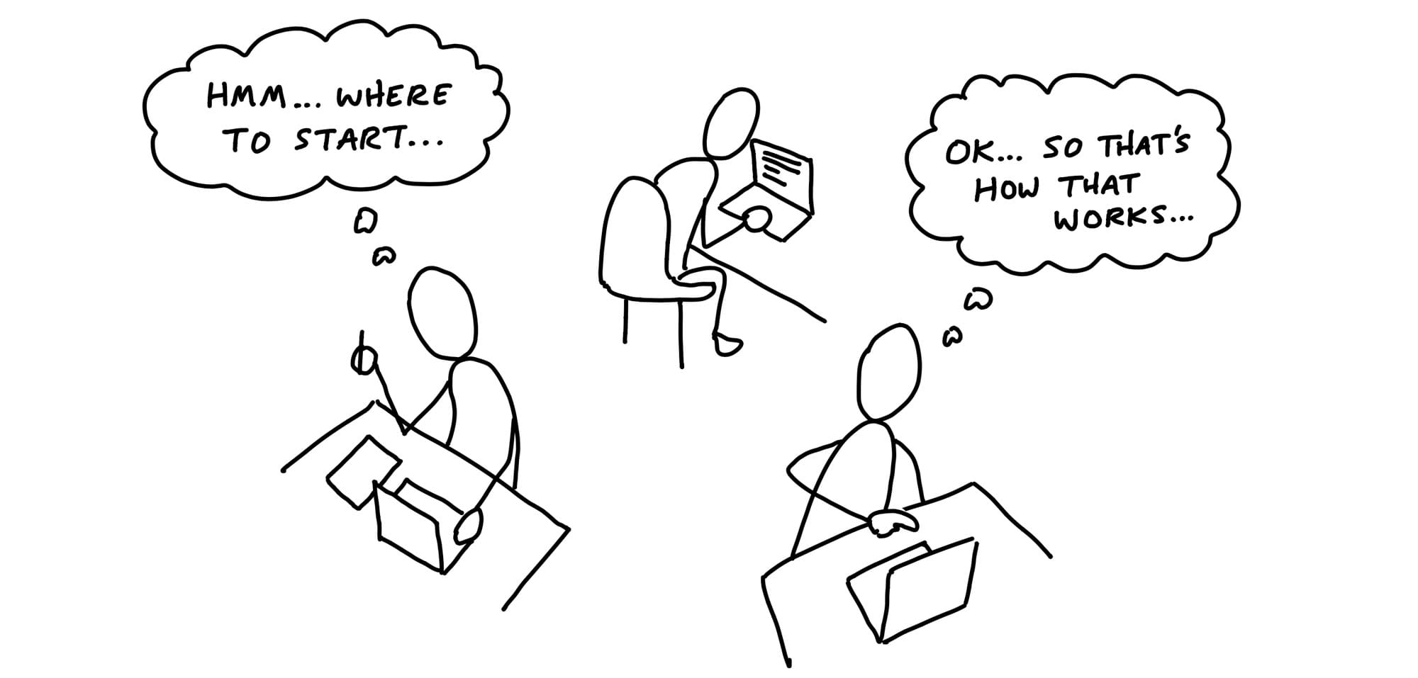
Getting oriented
Each person has their head down trying to figure out how the existing system works and which starting point is best.
The team figuring out where to start.
It’s important for managers to respect this phase. Teams can’t just dive into a code base and start building new functionality immediately. They have to acquaint themselves with the relevant code, think through the pitch, and go down some short dead ends to find a starting point.
Generally speaking, if the silence doesn’t start to break after three days, that’s a reasonable time to step in and see what’s going on.
Imagined vs discovered tasks
Since the team was given the project and not tasks, they need to come up with the tasks themselves.
Teams discover tasks by doing real work.
Often a task will appear in the process of doing something unrelated.
The way to really figure out what needs to be done is to start doing real work. That doesn’t mean the teams start by building just anything. They need to pick something meaningful to build first.
Get One Piece Done
It’s important at this early phase that the team don’t create a master plan of parts that should come together in the 11th hour.
Aim to make something tangible and demoable early - in the first week or so.
Integrate one slice
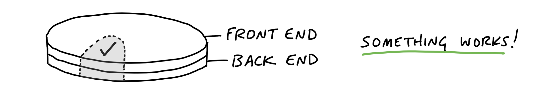
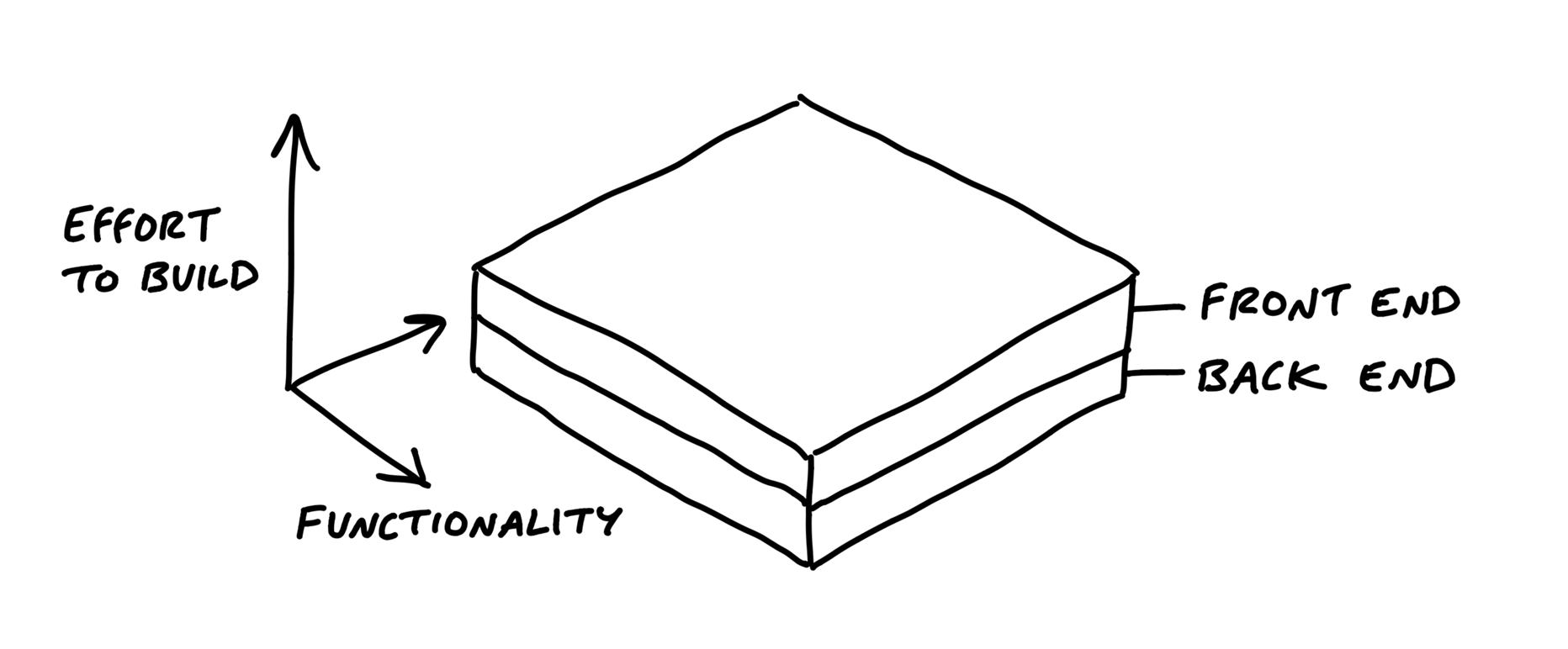
We can think of projects in two layers: front-end and back-end, design and code.
While technically speaking there are more layers than this, these two are the primary integration challenge in most projects.
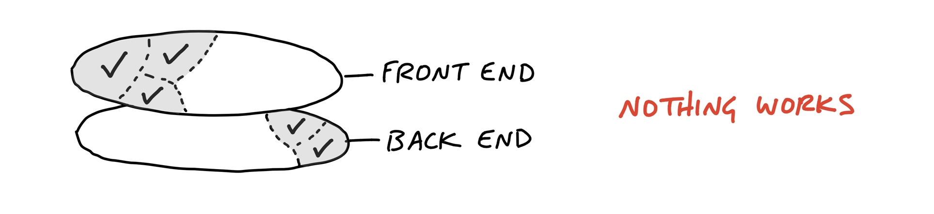
Pick off one slice of the project to integrate.
Case study: Clients in projects
We built a feature in Basecamp 3 that allowed service firms to invite clients to their projects and share chosen documents, messages, or to-do lists with them.
The concept, defined in the pitch, had a variety of moving parts:
- Client Access
- Client Management
- Visibility Toggle
After they got oriented and familiar with how the existing code worked, the designer chose the visibility toggle as the best place to integrate first.
It’s the one that would appear in demo videos and the interaction customers would use most.
He experimented with different affordances and placements in the app’s HTML templates.
Meanwhile, the programmer had enough guidance from the pitch to start spiking the access model.
As soon as the designer felt confident in the basic direction of the UI, he pinged the programmer and showed him the stubbed toggle. It worked from the service firm’s point of view. The designer could click it, feel it, and judge how well it worked with live data on a staging server.
There was still more design work to do on the toggle. But the programmer didn’t need to be involved anymore.
About three days after the start of the project, the designer demoed the working toggle to a manager. Their conversation led to a few more tweaks.
This short example illustrates a few points about how the teams integrate over short periods to finish one piece of the project at a time.
Programmers don’t need to wait
Because the important moving parts were already defined in the shaping process, programmers don’t need to sit idle waiting for design when the project starts.
There’s enough direction in the pitch for them to start working on back-end problems from the start.
They won’t be able to take a piece of functionality to completion without knowing where it leads on the front-end, but there should be enough information in the pitch to inform foundational modeling decisions.
Affordances before pixel-perfect screens
Programmers don’t need a pixel-perfect design to start implementing. All they need are endpoints: input elements, buttons, places where stored data should appear.
Questions about font, color, spacing, and layout can be resolved after the raw affordances are in place and hooked up in code.
That means the first interface a designer gives to a programmer can look very basic, like the example below.
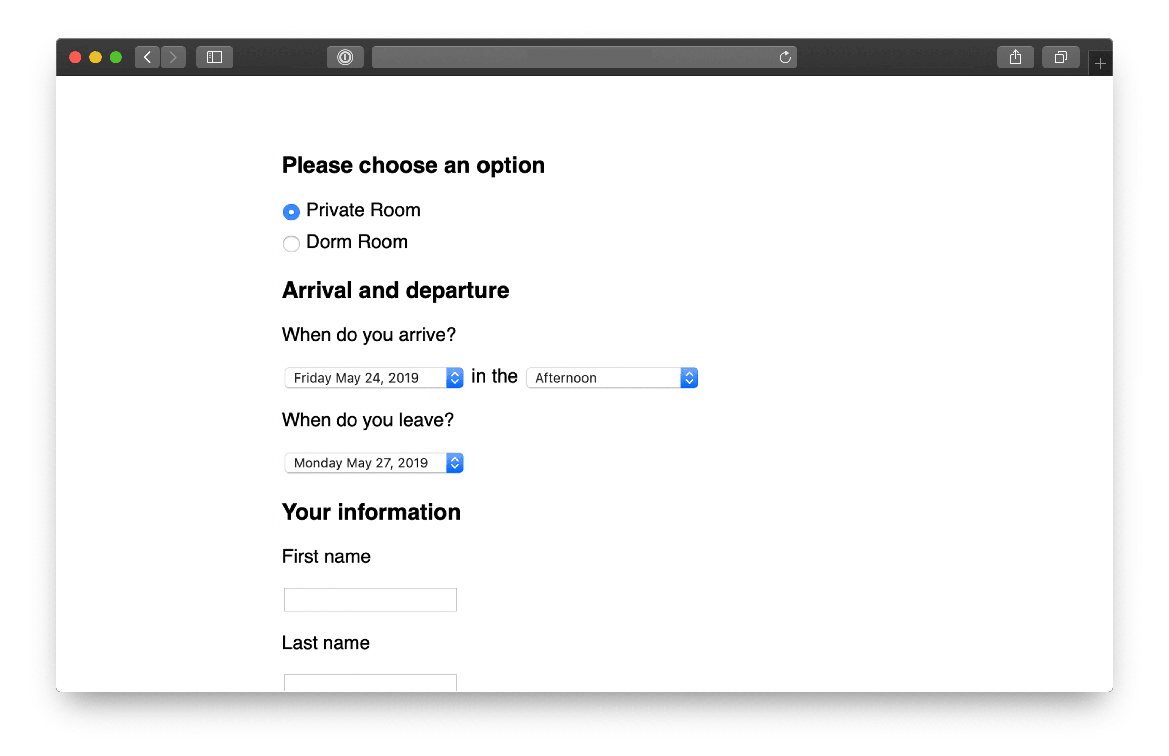
While the design looks simple, a lot of decisions are reflected in it.
- The decision to ask for arrival time but not departure time
- The specific options in the arrival time pulldown correspond to rules that had to be worked out about when to charge for meals and overnight stays.
- The designer’s first sketches used a calendar-style date picker for the arrival and departure days. But that led to UX problems.
Here’s another example. This is the first working piece of an app for capturing data from customer interviews.

Look at how raw this design is. As rough as it is, this design tests some important trade-offs.

Beautiful alignment, colors, and typography don’t matter on the first pass. Visual styling is important in the end product, not in the early stages.
Program just enough for the next step
The same is true for back-end work. It doesn’t have to be all or nothing. Sometimes a designer just needs some scaffolding

The point is to create a back-and-forth between design and programming on the same piece of the product. Instead of one big hand-off, take turns layering in affordances, code, and visual styling.
Start in the middle
In the examples above, the team didn’t build log in first. They jumped straight into the middle where the interesting problem was and stubbed everything else to get there.
Three criteria to think about when choosing what to build first:
First, it should be core.
Second, it should be small.
Third, it should be novel.
Map the Scopes
Organize by structure, not by person
When asked to organize tasks for a project, people often separate work by person or role: they’ll create a list for Designers and a list for Programmers. This leads to the problem we talked about in the previous chapter - people will complete tasks, but the tasks won’t add up to a finished part of the project early enough.
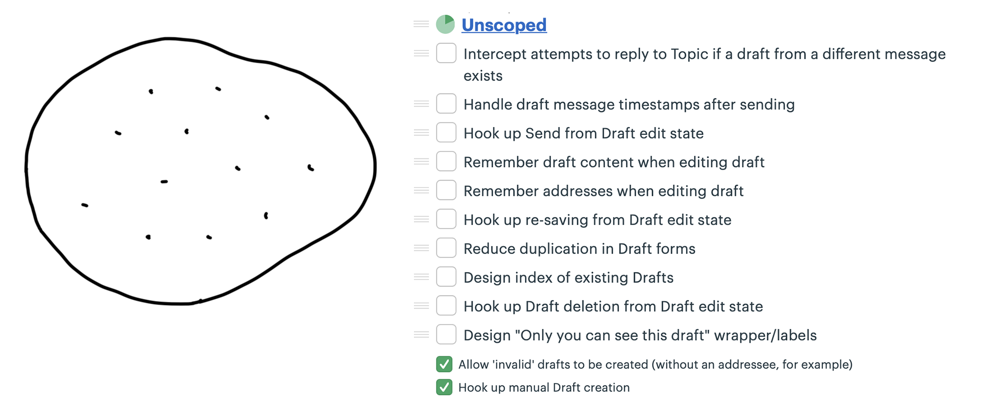
We call these integrated slices of the project scopes. We break the overall scope (singular) of the project into separate scopes (plural) that can be finished independently of each other.
The scope map
An outline from the shaping work that preceded the project.

When the team members take over the project, they start discovering tasks.

But we don’t want to stay with this picture for long. It’s too low-level. There’s nothing visible from high altitude.
As the team starts doing real work on the project they learn how the tasks are related and what the structure of the project is really like.
They factor the project into scopes.
The scopes reflect the meaningful parts of the problem that can be completed independently and in a short period of time
The language of the project
Scopes are more than just slices. They become the language of the project at the macro level.
When it’s time to report status, the team uses the language of scopes to explain what’s done and what’s not done.
It’s more satisfying to have the conversation at a high level and point to finished pieces of software, instead of going down into the weeds and defending the purposes and status of individual outstanding tasks.
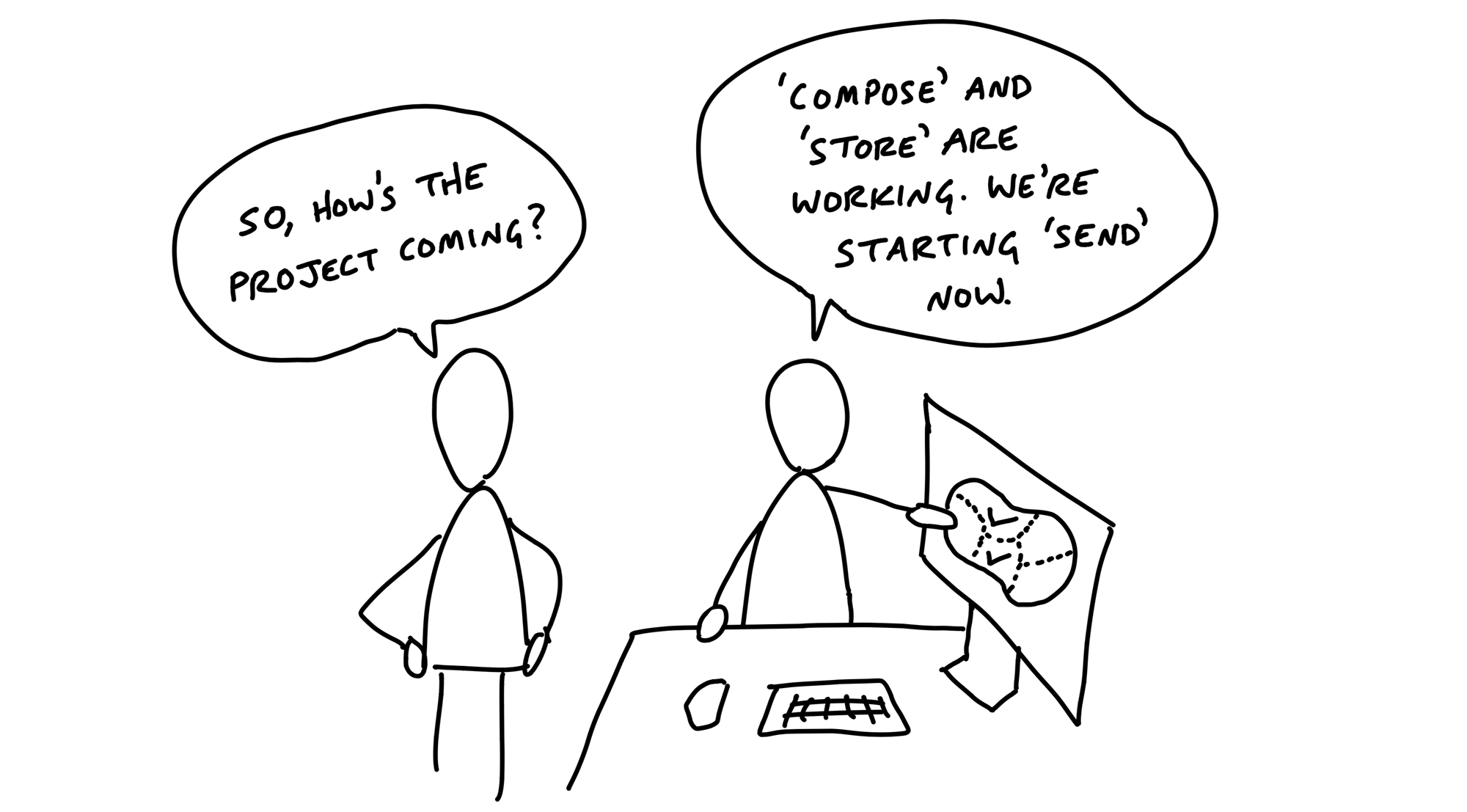
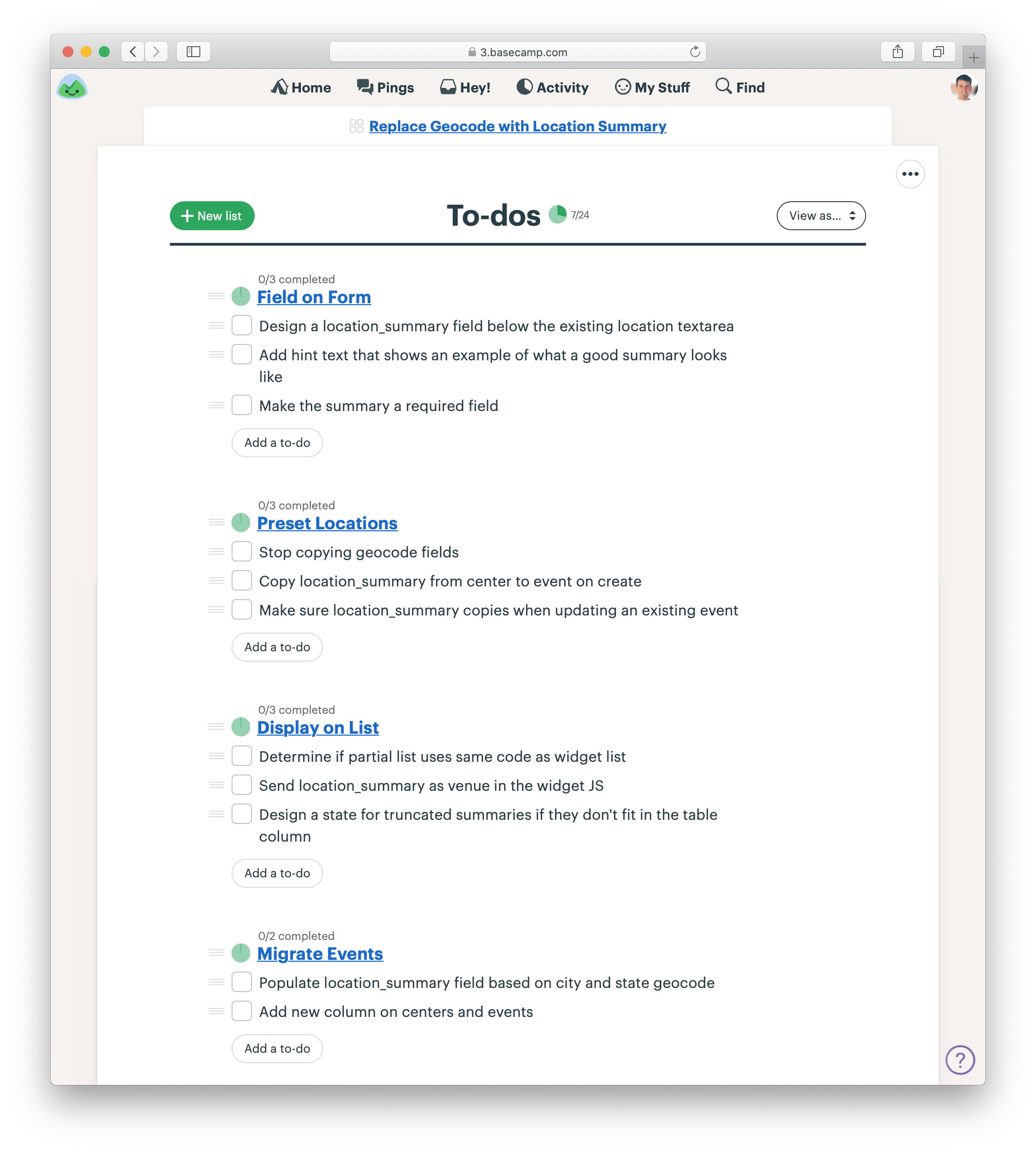
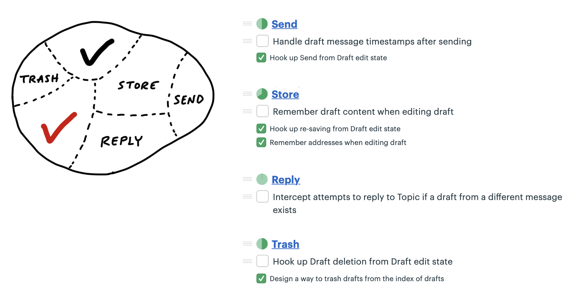
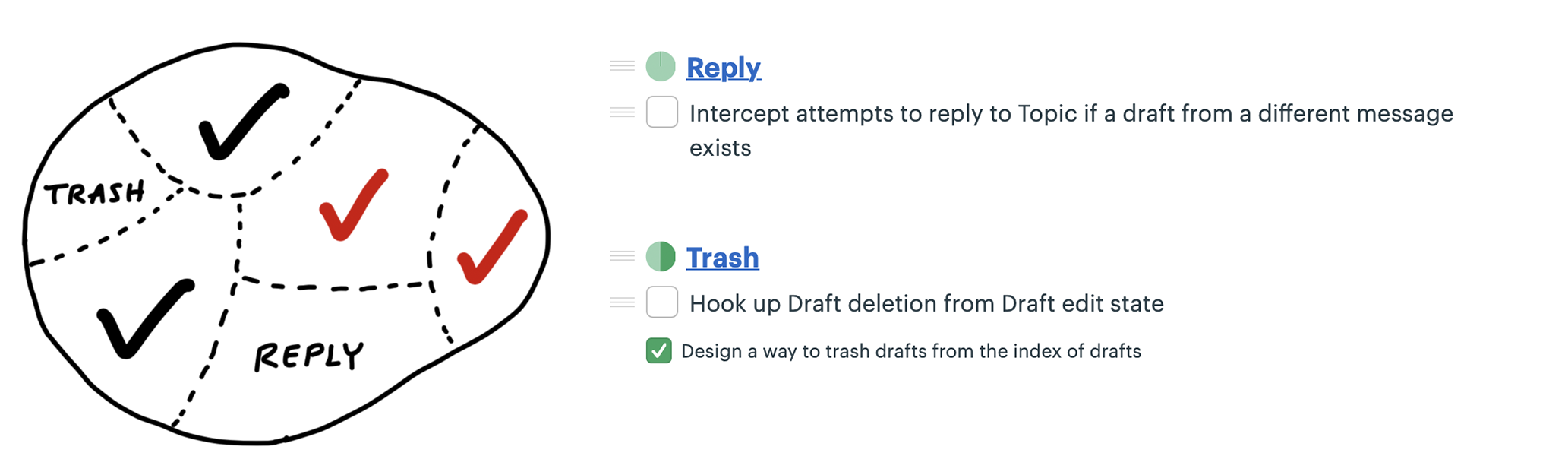
Case study: Message drafts
A designer and programmer were building a feature to create and save drafts of messages in a new app.
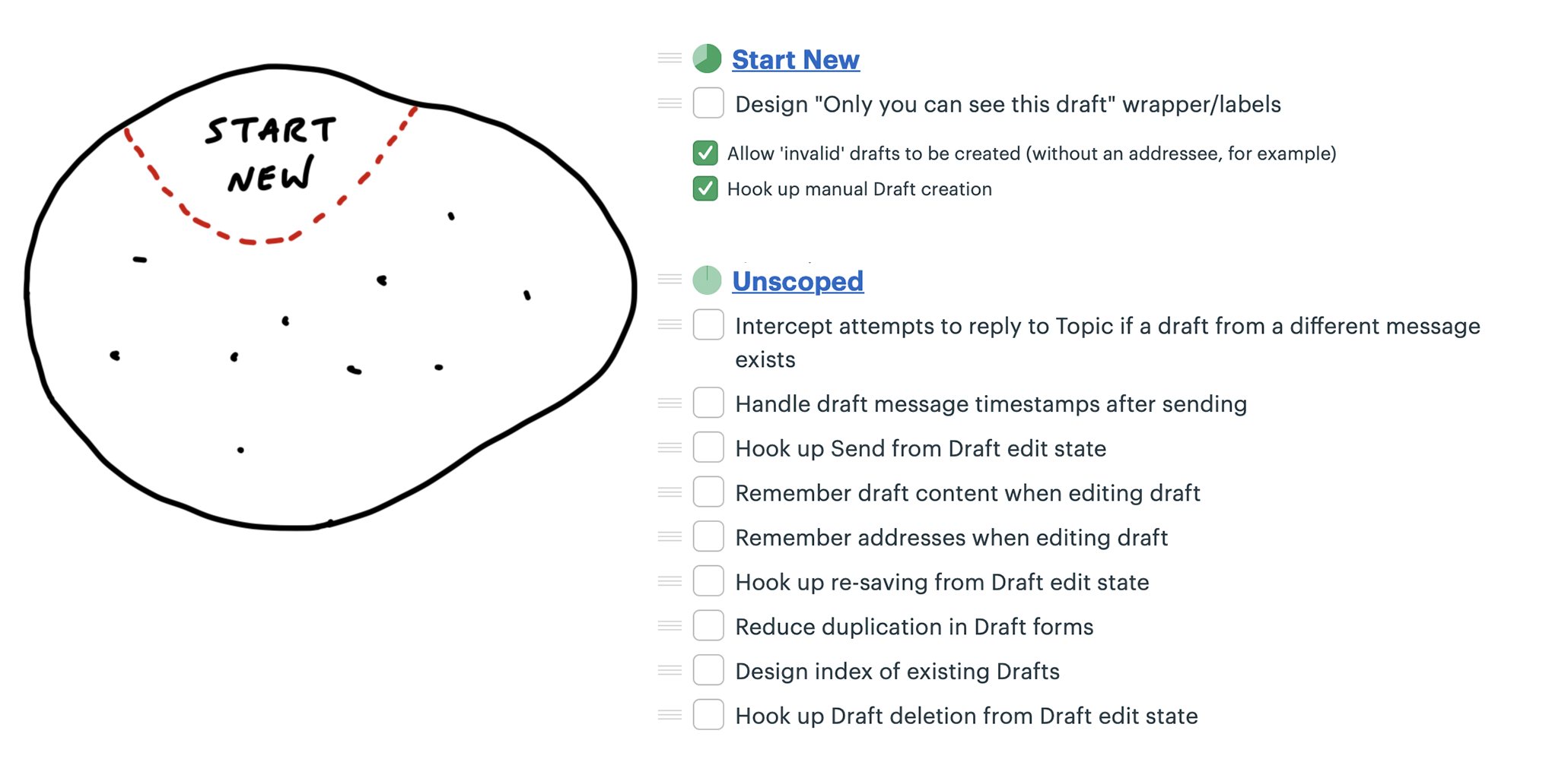
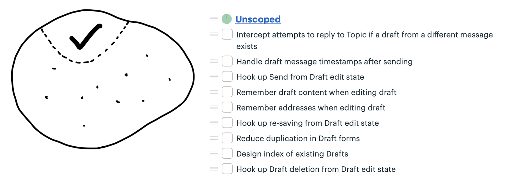
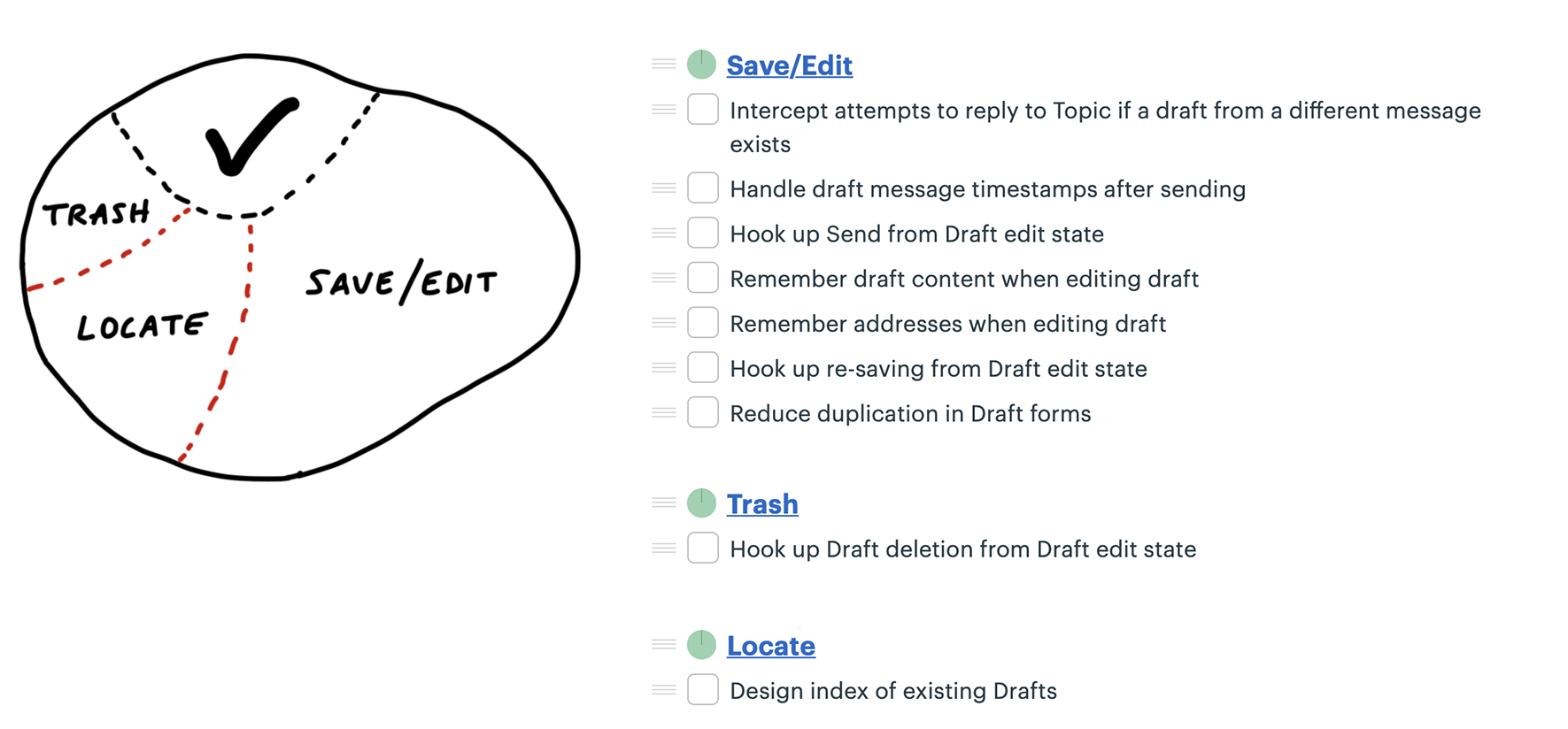
Noticed she could carve off a couple pieces to make more visible progress. First she factored out the work related to sending the drafted message. She called that Send.
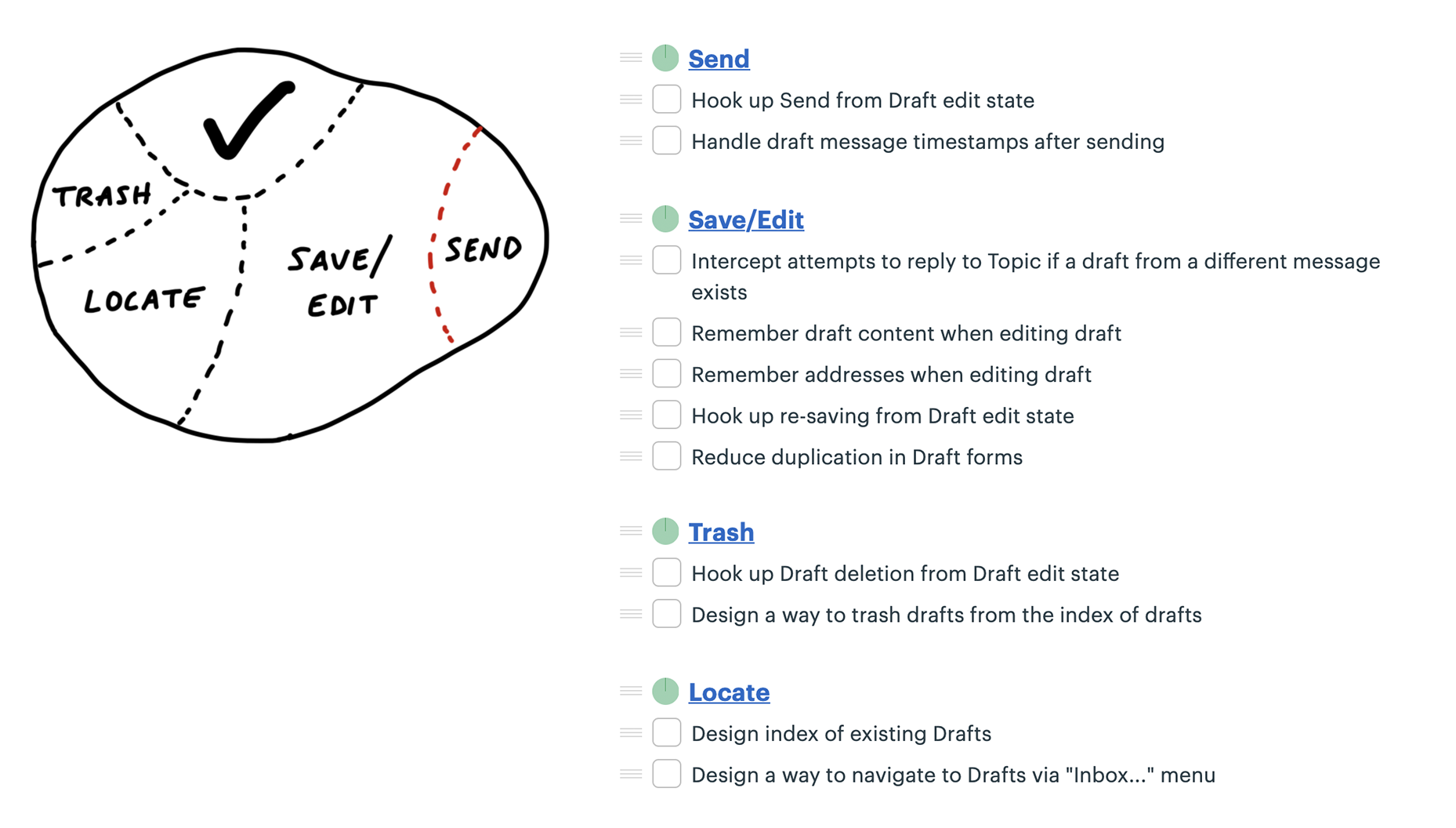
Two new scopes: Store and Reply.
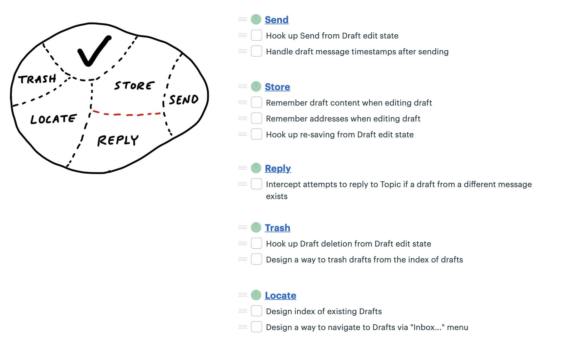
Discovering scopes
Scope mapping isn’t planning. You need to walk the territory before you can draw the map.
Scopes reflect the real ground truth of what can be done independently
Scopes arise from interdependencies.
At the start of a project, we don’t expect to see accurate scopes.
It’s also normal to see some shuffling and instability in the scopes at first.
How to know if the scopes are right
Well-made scopes show the anatomy of the project.
Three signs indicate when the scopes are right:
- You feel like you can see the whole project and nothing important that worries you is hidden down in the details.
- Conversations about the project become more flowing because the scopes give you the right language.
- When new tasks come up, you know where to put them. The scopes act like buckets that you can easily lob new tasks into.
On the other hand, these three signs indicate the scopes should be redrawn:
- It’s hard to say how “done” a scope is. This often happens when the tasks inside the scope are unrelated.
- The name isn’t unique to the project, like “front-end” or “bugs.” We call these “grab bags” and “junk drawers.”
- It’s too big to finish soon.
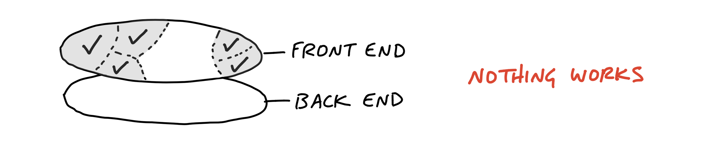
Layer cakes
Most software projects require some UI design and a thin layer of code below.
Think of a database app where all you need to do is enter information, save it, and display it back.
Work like this looks like a layer cake: You can judge the work by UI surface area because the back-end work is thin and evenly distributed.
In these cases, you can integrate all design and programmer tasks together in the same scope.
Icebergs
But sometimes there is significantly more back-end work than UI work or vice versa.
For icebergs, it can help to factor out the UI as a separate scope of work
If the back-end is complex enough, you can split it into separate concerns and then turn those into scopes as well.
For both back-end and front-end icebergs, we always question them before accepting them as a fact. Is the complexity really necessary and irreducible?
Chowder
There are almost always a couple things that don’t fit into a scope. We allow ourselves a “Chowder” list for loose tasks that don’t fit anywhere.
If it gets longer than three to five items, something is fishy and there’s probably a scope to be drawn somewhere.
Mark nice-to-haves with ~
This allows everyone on the team to constantly sort out the must-haves from the nice-to-haves.
In a fixed time box, we need a machete in our hands to cut down the constantly growing scope.
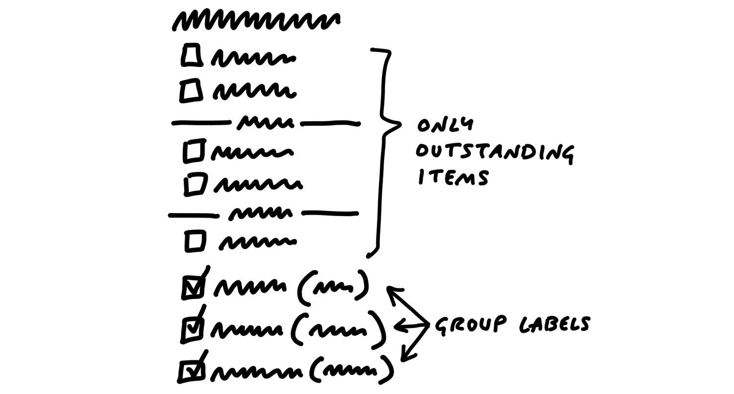
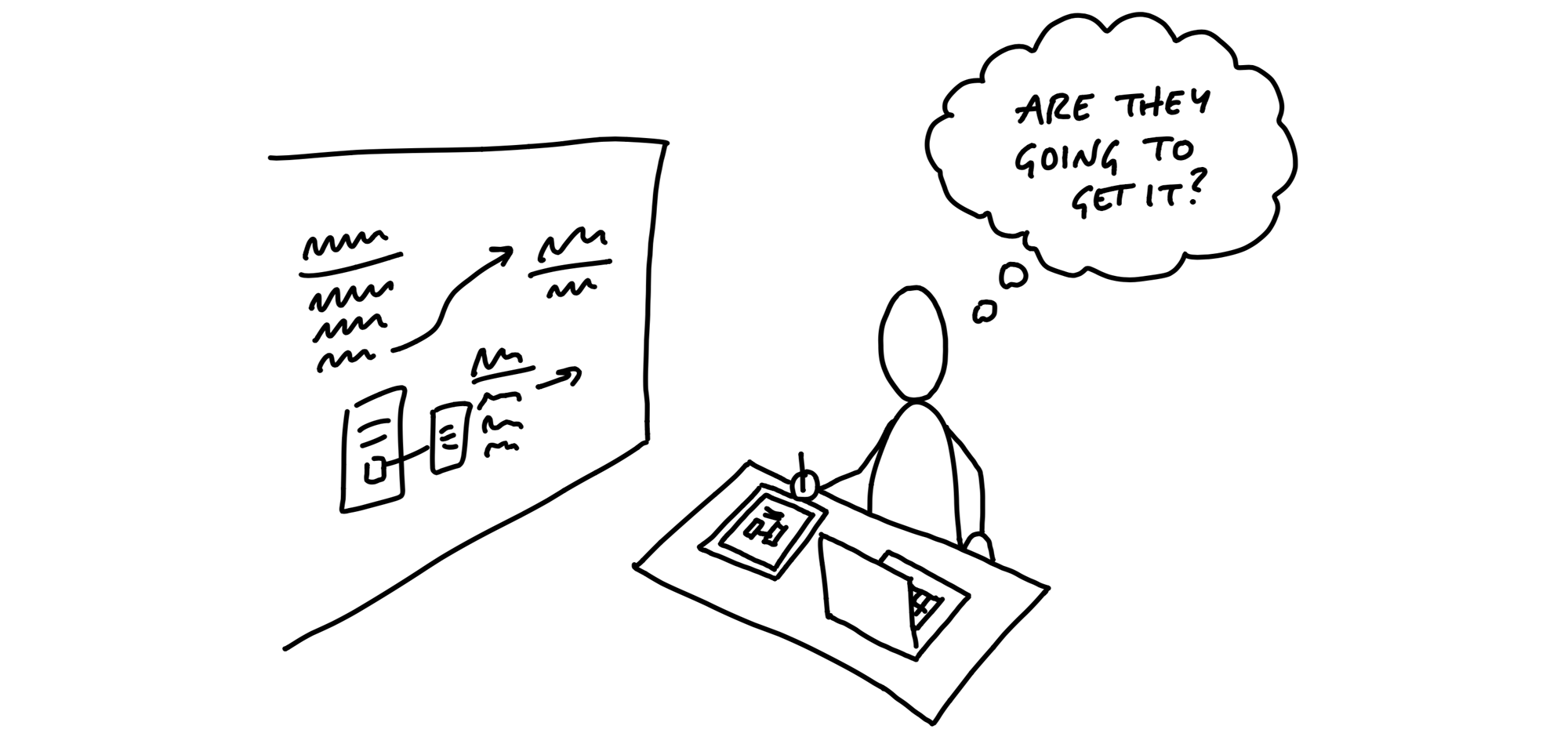
Show Progress
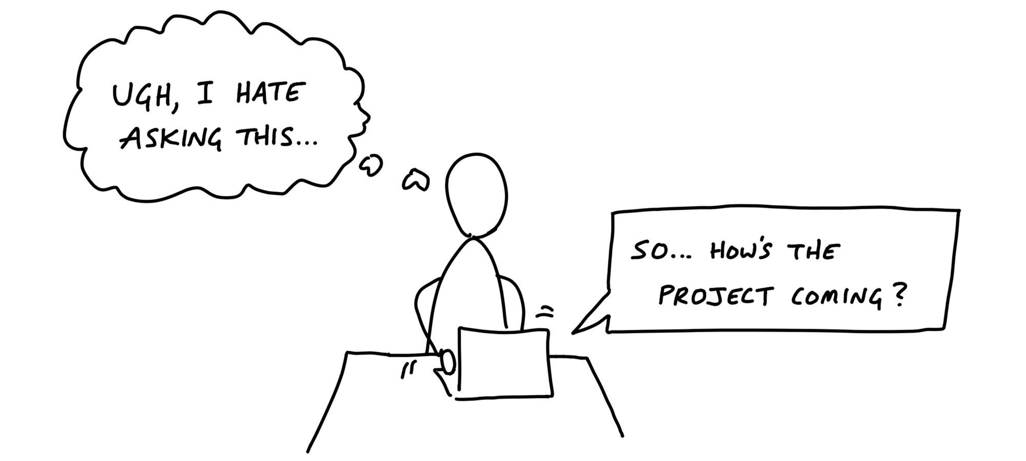
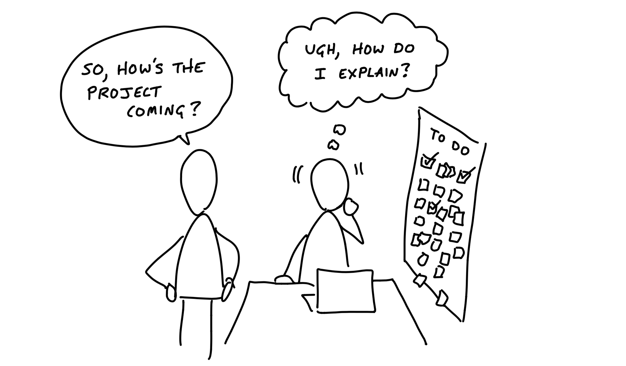
Good-hearted managers don’t like asking for status.
Managers would rather be able to see the status themselves whenever they need to.
The tasks that aren’t there
Imagined versus discovered tasks.
In real life, issues are discovered by getting involved in the problem. That means to-do lists actually grow as the team makes progress.
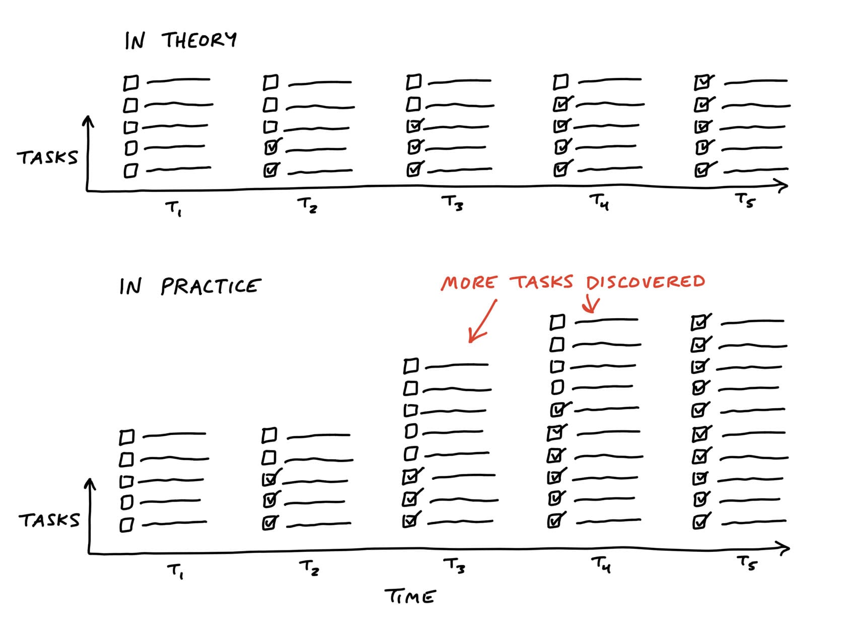
If we tried to judge at t2 how far along the project is, we’d be misled.
Estimates don’t show uncertainty
The problem with estimates is they have a very different meaning depending on the nature of the work being estimated.
Say you have two tasks, both estimated to take four hours. If one task is something the team has done ten times in the past, you can be confident in the estimate.
It’s not meaningful to write “4 hours, or maybe 3 days” as the estimate.
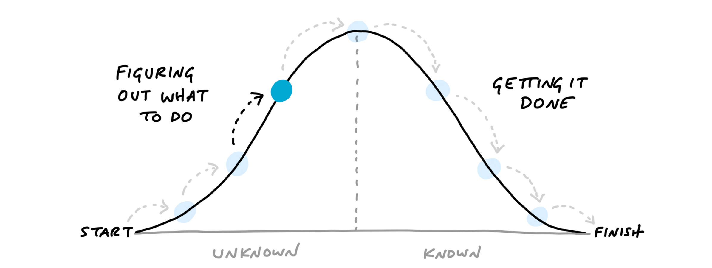
Recognizing this, we came up with a way to see the status of the project without counting tasks and without numerical estimates. We do that by shifting the focus from what’s done or not done to what’s unknown and what’s solved. To enable this shift, we use the metaphor of the hill.
Work is like a hill
Every piece of work has two phases.
- First there’s the uphill phase of figuring out what our approach is and what we’re going to do.
- Then, once we can see all the work involved, there’s the downhill phase of execution.
Scopes on the hill
We can combine the hill with the concept of scopes from the last chapter.
The scopes give us the language for the project (“Locate,” “Reply”).
The hill describes the status of each scope (“uphill,” “downhill”).
To see the status of the scopes, we can plot each one as a different color on the hill.
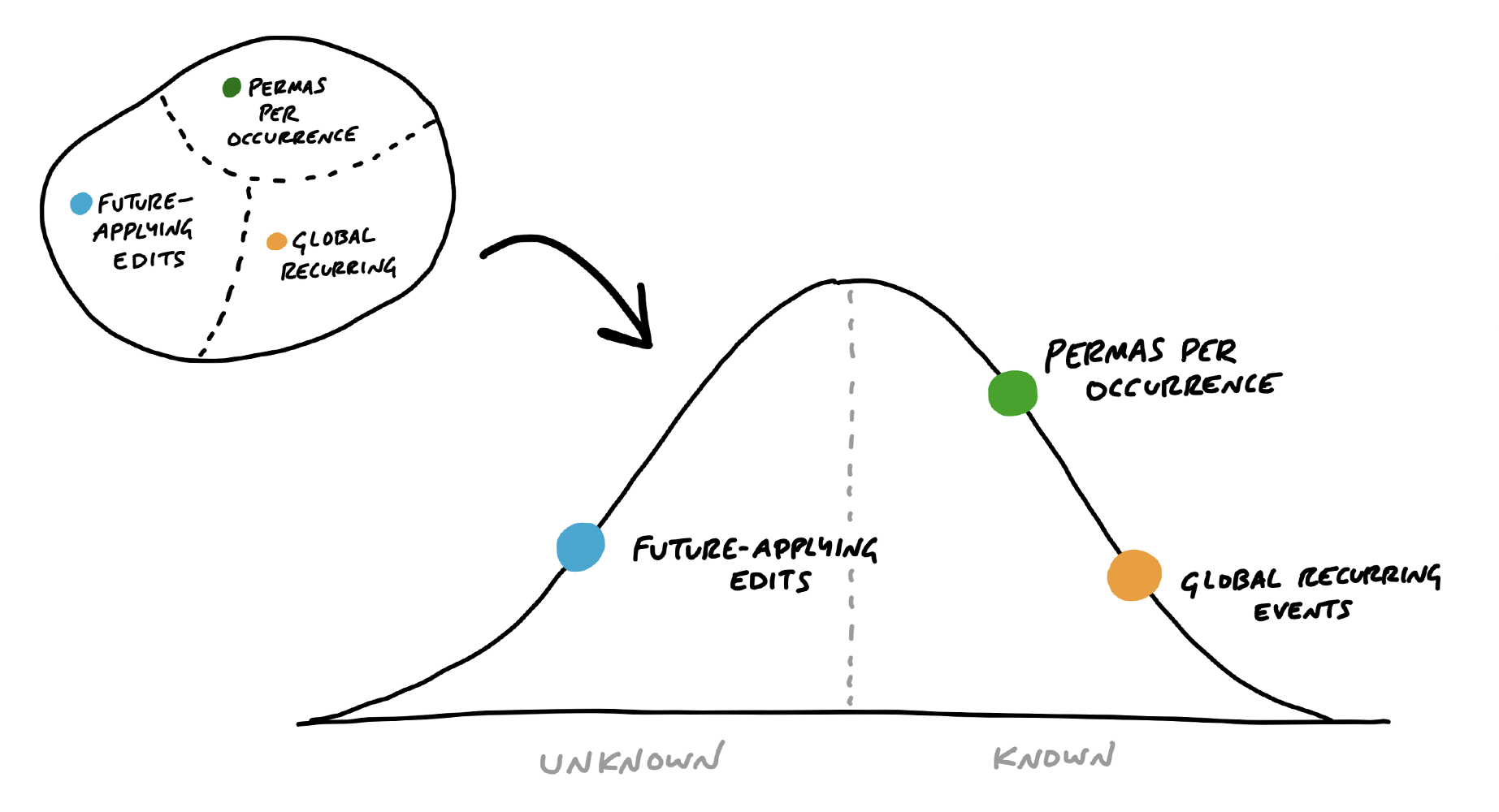
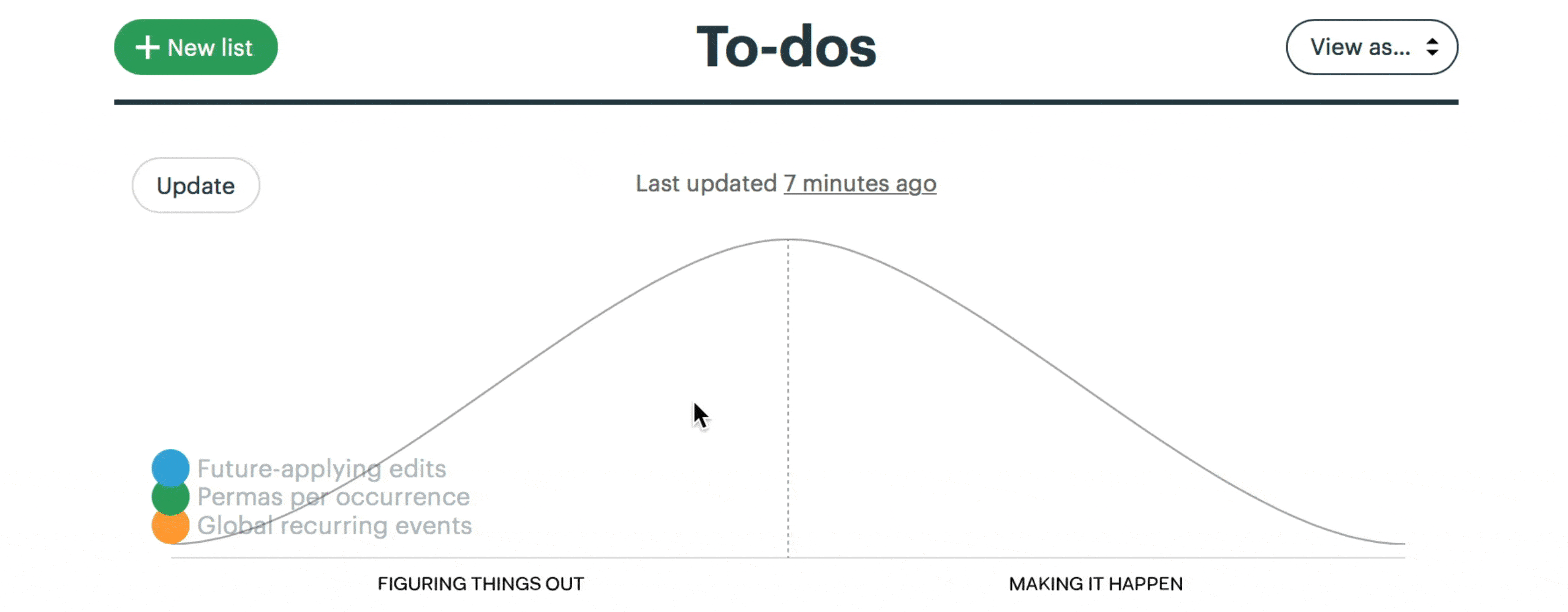
This is a snapshot from a project to implement recurring events in Basecamp. Here “Future-applying edits” is a scope that is still being worked out, with significant unknowns to solve. The other two scopes have no meaningful unknowns left, and “Global recurring events” is closer to finished.
Status without asking
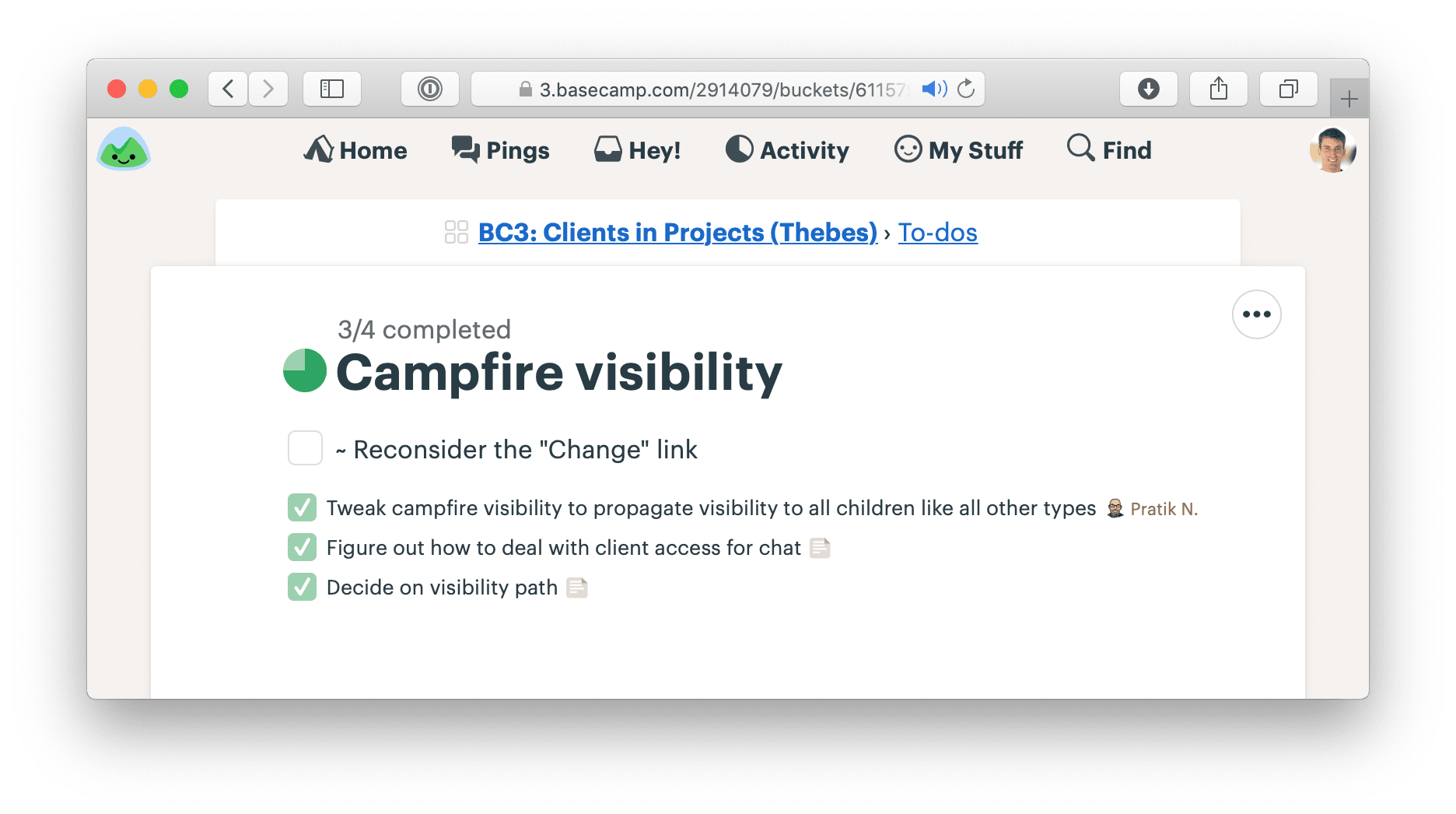
We built a feature exclusive to Basecamp for creating hill charts and updating them with a few clicks.
Nobody says “I don’t know”
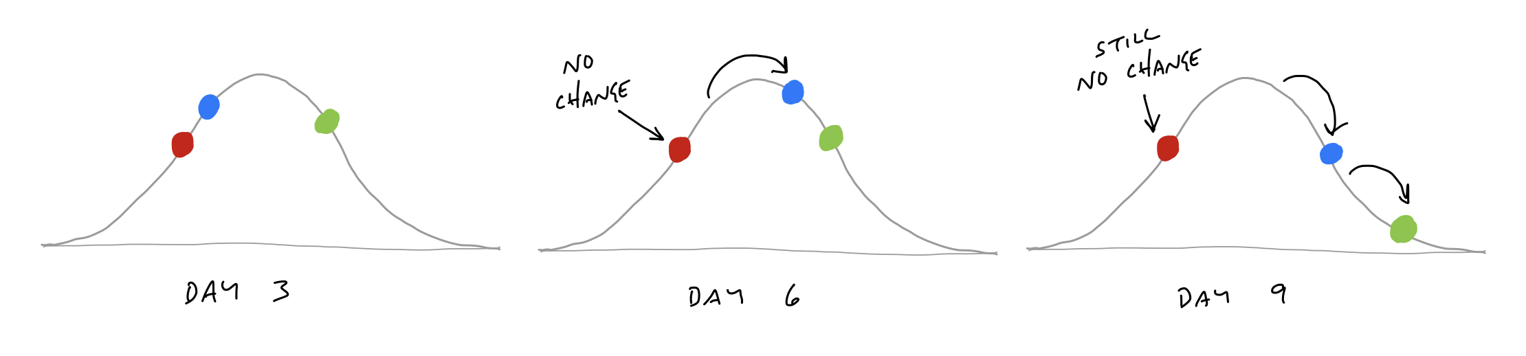
The hill chart allows everybody to see that somebody might be stuck without them actually saying it. A dot that doesn’t move is effectively a raised hand: “Something might be wrong here.”
Prompts to refactor the scopes
Sometimes probing into a stuck scope reveals that it isn’t stuck at all. The problem is in how the lines of the scope were drawn.
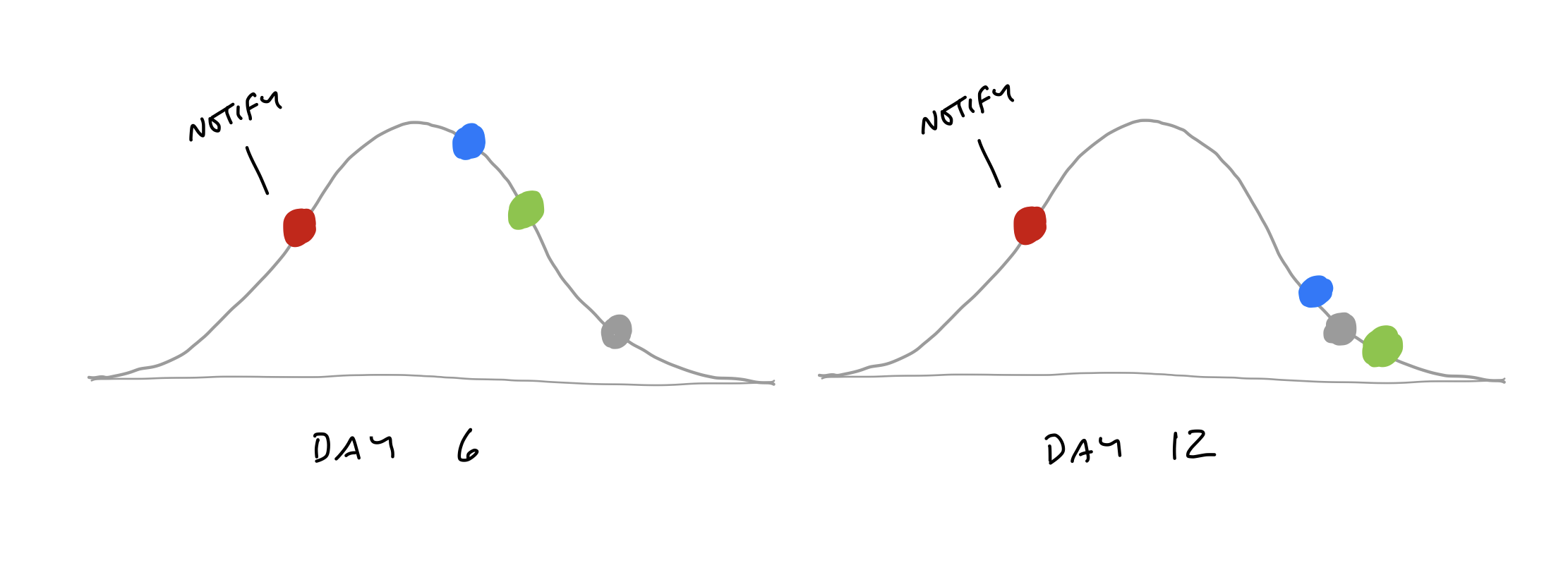
When we checked in with the team, it turned out the work was moving along just fine. The problem was that “Notify” wasn’t a single thing.
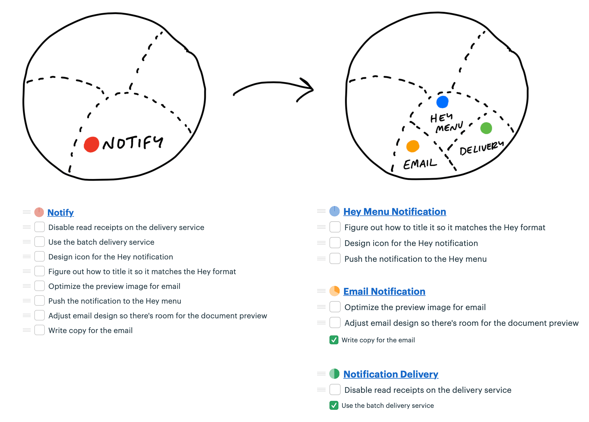
With the scopes separated out, they can move independently over time.

Build your way uphill
Some teams struggle with backsliding when they first try the hill chart. They consider a scope solved, move it the top of the hill, and later have to slide it back when they uncover an unexpected unknown.
Solve in the right sequence
Journalists have a concept called the “inverted pyramid.” The idea is their articles start with the most essential information at the top, then they add details and background information in decreasing order of importance. This allows print newspaper designers to get the crucial part of the story on the front page and cut the end as needed without losing anything essential.
Effective teams sequence their problem solving in the same way. They choose the most important problems first with the most unknowns, get them to the top of the hill, and leave the things that are the most routine or least worrisome for last.
As the end of the cycle approaches, teams should have finished the important things and left a variety of “nice to haves” and “maybes” lingering around.
Decide When to Stop
When the end of the cycle approaches, the techniques we covered so far will put the team in a good position to finish and ship. The shaped work gave them guard rails to prevent them from wandering. They integrated one scope at a time so there isn’t half-finished work lying around. And all the most important problems have been solved because they prioritized those unknowns first when they sequenced the work.
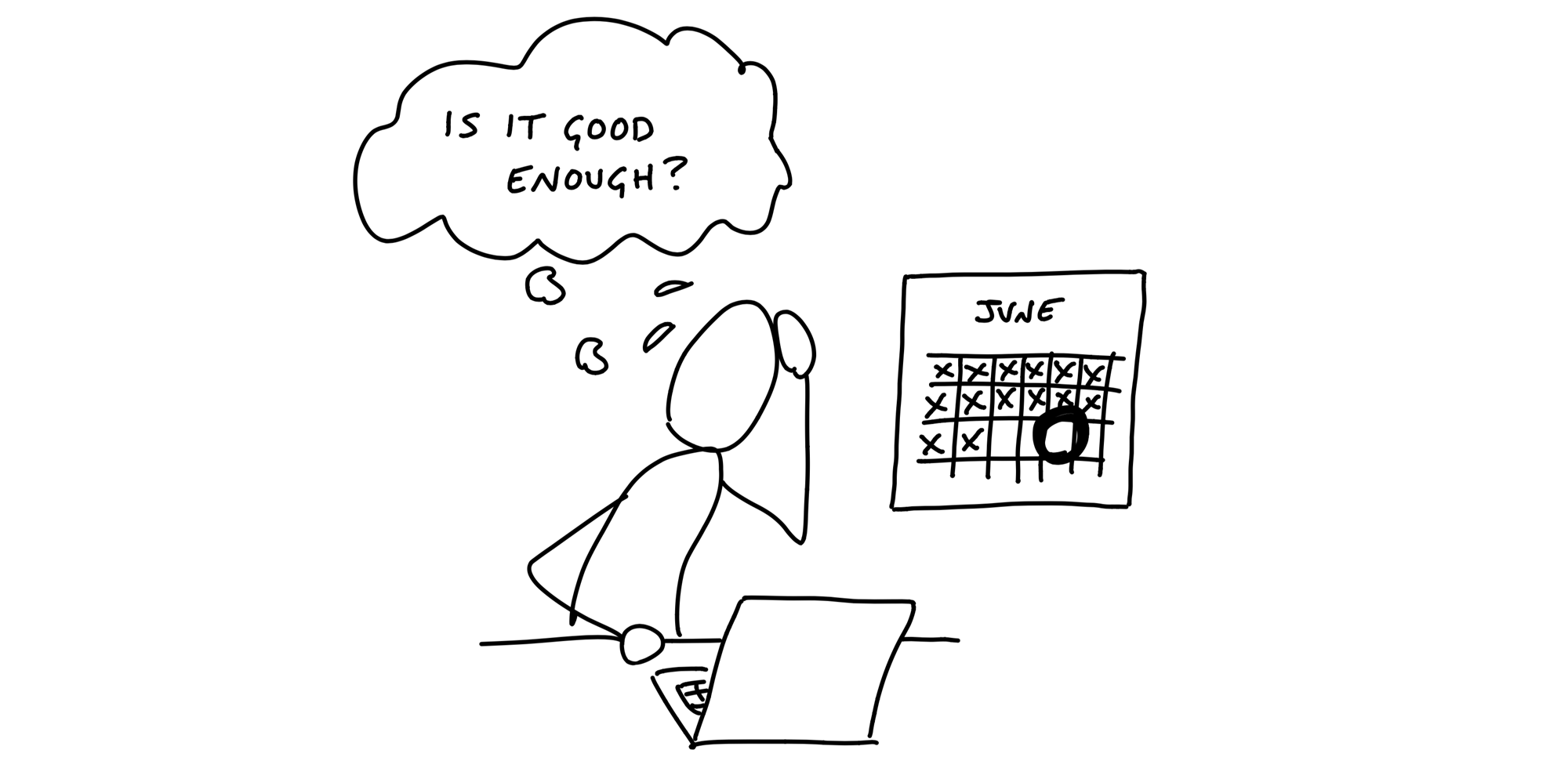
Still, there’s always more work than time. Shipping on time means shipping something imperfect. There’s always some queasiness in the stomach as you look at your work and ask yourself: Is it good enough? Is this ready to release?
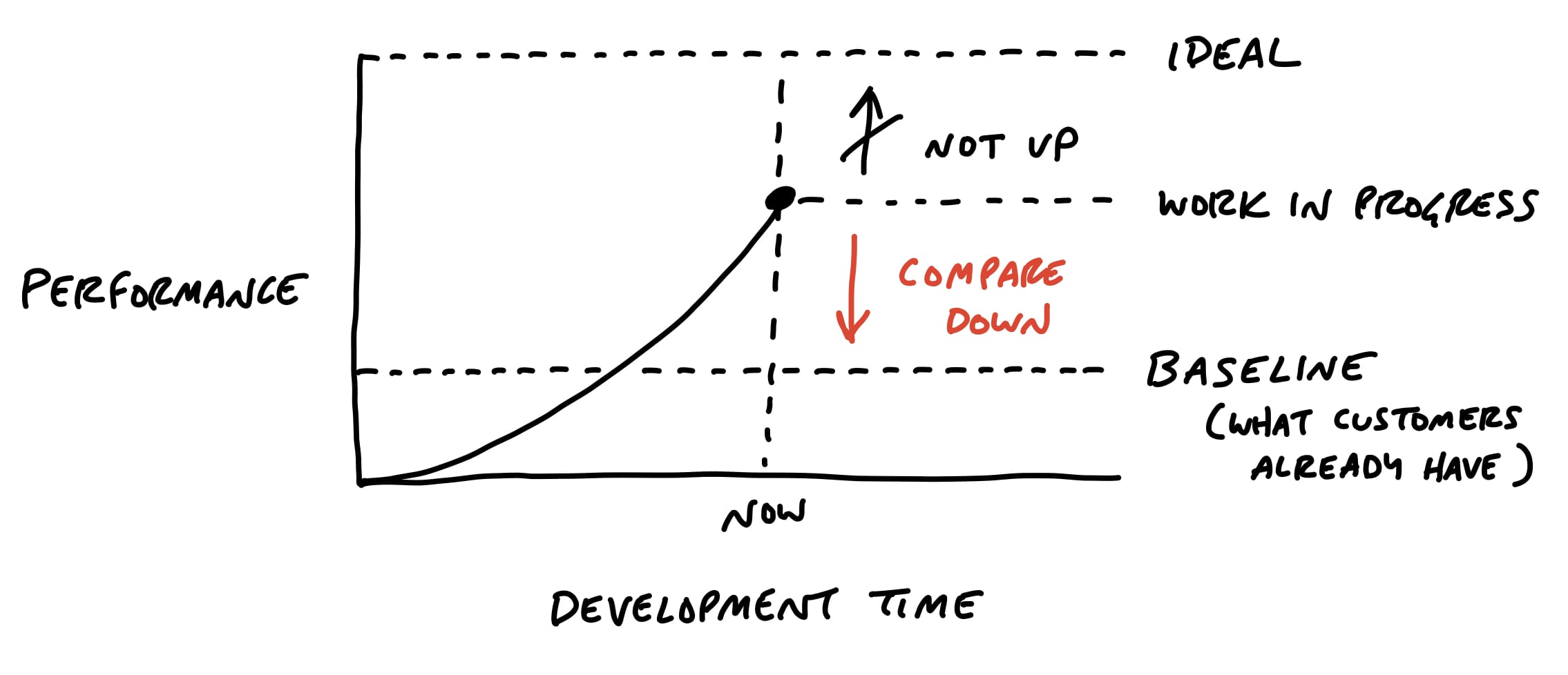
Compare to baseline
Designers and programmers always want to do their best work. Pride in the work is important for quality and morale, but we need to direct it at the right target. If we aim for an ideal perfect design, we’ll never get there. At the same time, we don’t want to lower our standards.
It helps to shift the point of comparison. Instead of comparing up against the ideal, compare down to baseline - the current reality for customers...
- How do customers solve this problem today, without this feature?
- What’s the frustrating workaround that this feature eliminates?
- How much longer should customers put up with something that doesn’t work or wait for a solution because we aren’t sure if design A might be better than design B?
Limits motivate trade-offs
Recall that the six-week bet has a circuit breaker - if the work doesn’t get done, the project doesn’t happen.
We expect our teams to actively make trade-offs and question the scope instead of cramming and pushing to finish tasks.
Scope grows like grass
Scope grows naturally. Scope creep isn’t the fault of bad clients, bad managers, or bad programmers. Projects are opaque at the macro scale.
Rather than trying to stop scope from growing, give teams the tools, authority, and responsibility to constantly cut it down.
Cutting scope isn’t lowering quality
Making choices makes the product better.
Being picky about scope differentiates the product.
The trick is asking ourselves which things actually matter, which things move the needle, and which things make a difference for the core use cases we’re trying to solve.
Scope hammering
We use hammering to reflect the power and force it takes to repeatedly bang the scope so it fits in the time box.
- Is this a “must-have” for the new feature?
- Could we ship without this?
- What happens if we don’t do this?
- Is this a new problem or a pre-existing one that customers already live with?
- How likely is this case or condition to occur?
- When this case occurs, which customers see it? Is it core - used by everyone
- or more of an edge case?
- What’s the actual impact of this case or condition in the event it does happen?
- When something doesn’t work well for a particular use case, how aligned is that use case with our intended audience?
Throughout the cycle, talk about must-haves and nice-to-haves
QA is for the edges
QA can limit their attention to edge cases because the designers and programmers take responsibility for the basic quality of their work.
We think of QA as a level-up, not a gate
QA generates discovered tasks that are all nice-to-haves by default.
The designer-programmer team triages them and, depending on severity and available time, elevates some of them to must-haves.
When to extend a project
First, the outstanding tasks must be true must-haves that withstood every attempt to scope hammer them.
Second, the outstanding work must be all downhill. No unsolved problems; no open questions.
Even if the conditions are met to consider extending the project, we still prefer to be disciplined and enforce the appetite for most projects.
But this shouldn’t become a habit.
Move On
Let the storm pass
Shipping can actually generate new work if you’re not careful.
The feedback can be especially intense if the feature you shipped changes existing workflows.
It’s important to stay cool and avoid knee-jerk reactions. Give it a few days and allow it to die down. Be firm and remember why you made the change in the first place and who the change is helping.
Stay debt-free
It can be tempting to commit to making changes in response to feedback, but then you no longer have a clean slate for the next cycle. Remember: these are just raw ideas coming in. The way to handle them is with a gentle “no.”
Remember, the thing you just shipped was a six-week bet. If this part of the product needs more time, then it requires a new bet.
Let the requests or bugs that just came up compete with everything else at the next betting table to be sure they’re strategically important.
Feedback needs to be shaped
The raw ideas that just came in from customer feedback aren’t actionable yet.
If a request is truly important, you can make it your top priority on the shaping track of the next cycle.
Bet on something else for the teams to build and use that time to properly shape the new idea.